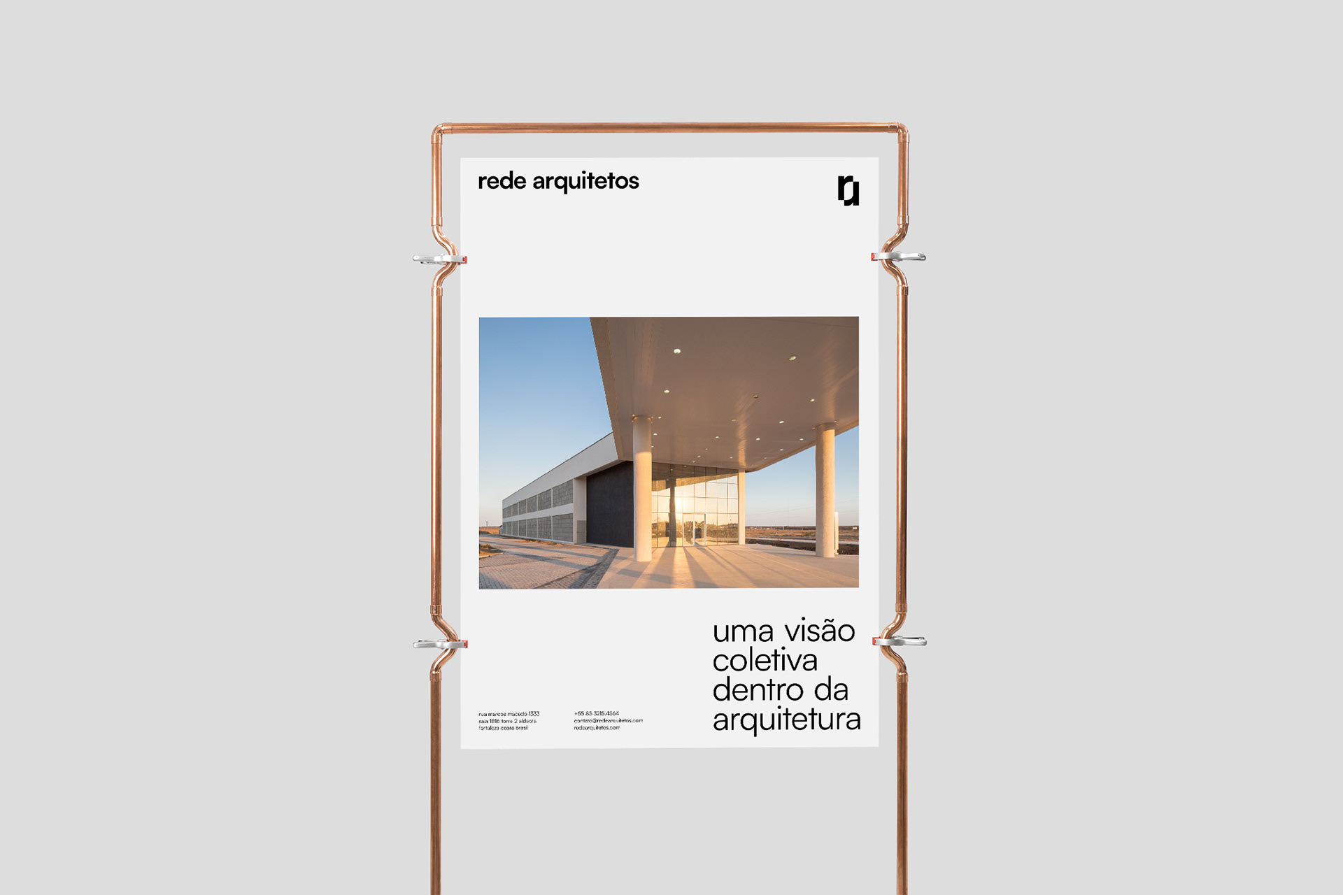
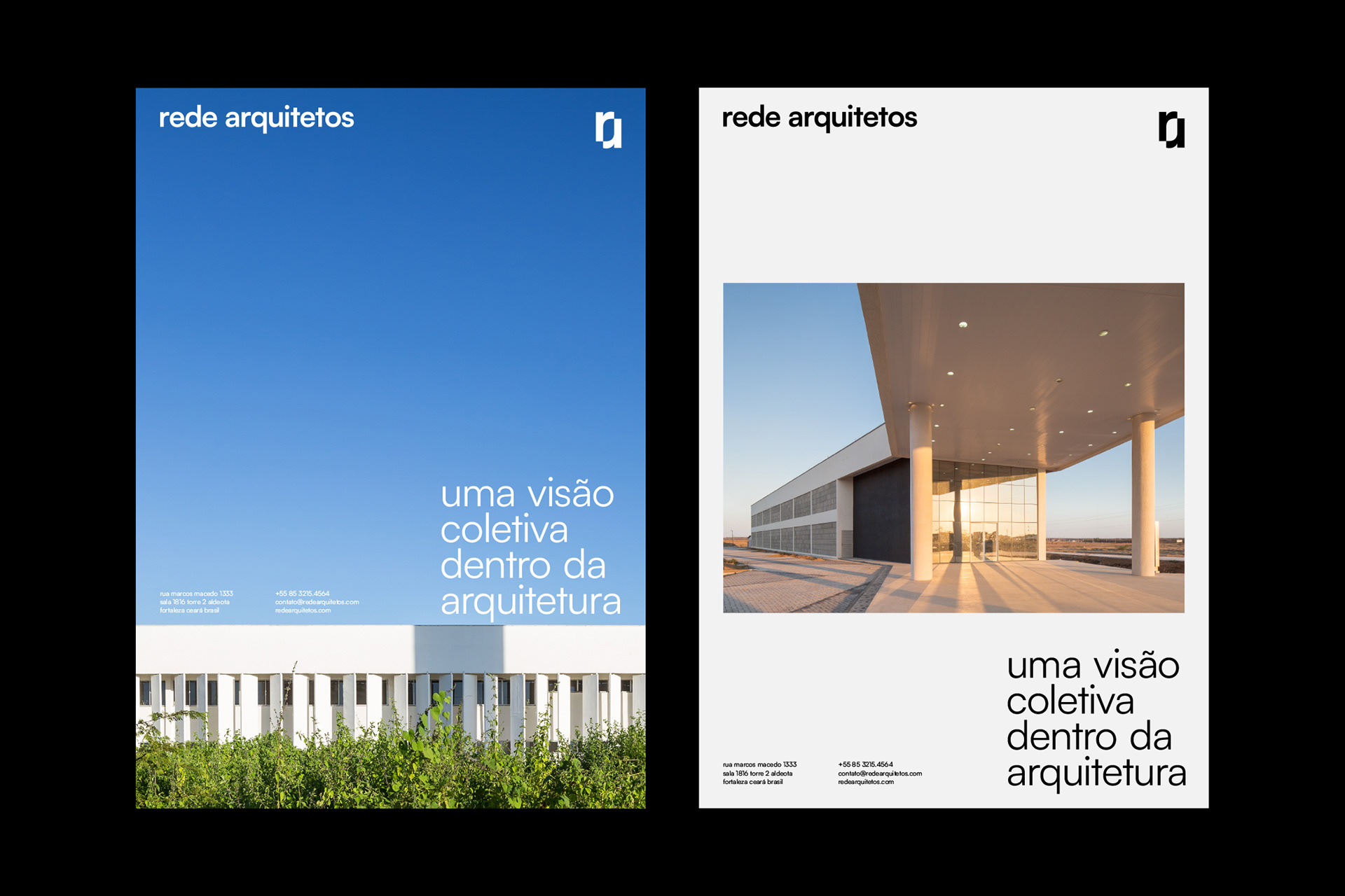
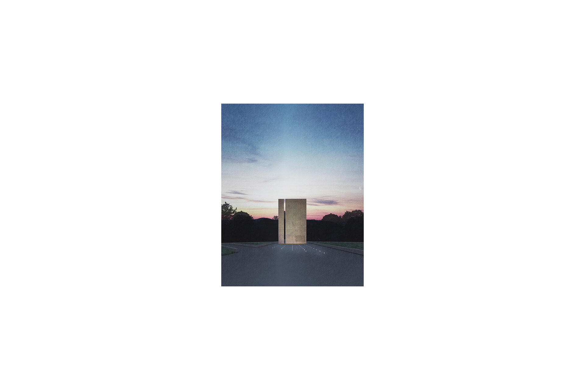
Rede Arquitetos is a collaborative architecture studio located in Fortaleza (CE) – Brazil. In 2021 the group celebrated 10 years of activity and, to celebrate the beginning of a new phase, they decided to recreate their brand and visual identity. The objective was to create a brand that could dialogue with Rede's modus operandi, whose work of the partners is done through a minimalist, modern and flexible architecture, which comes from a strongly academic origin.
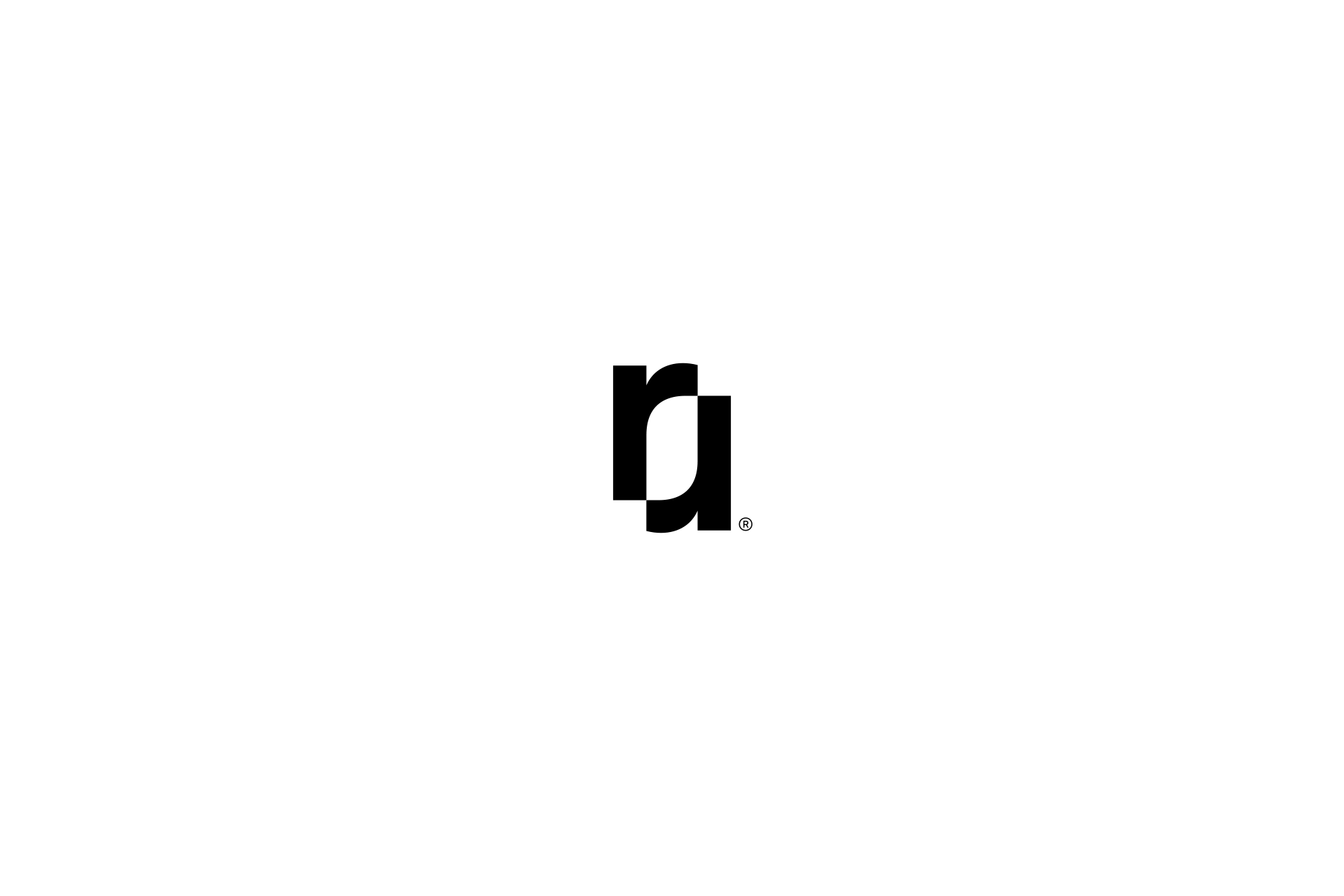
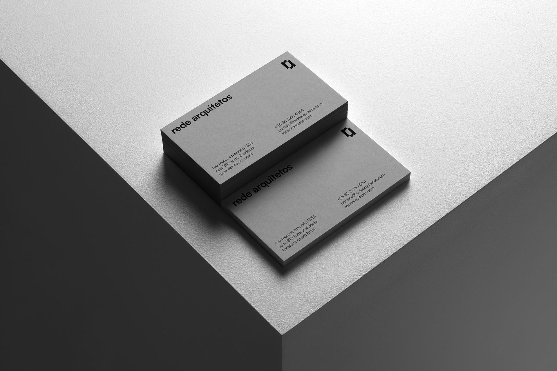
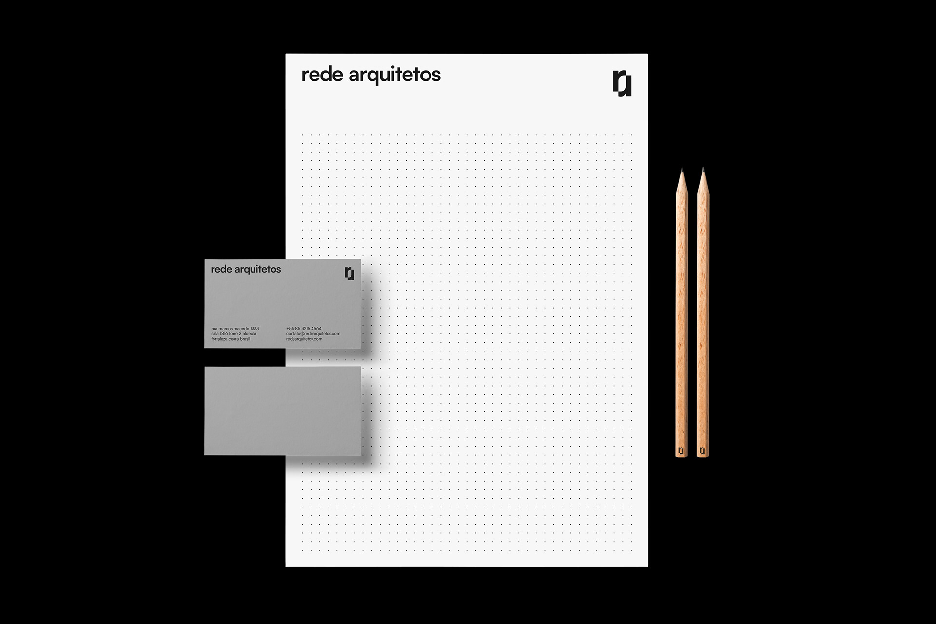
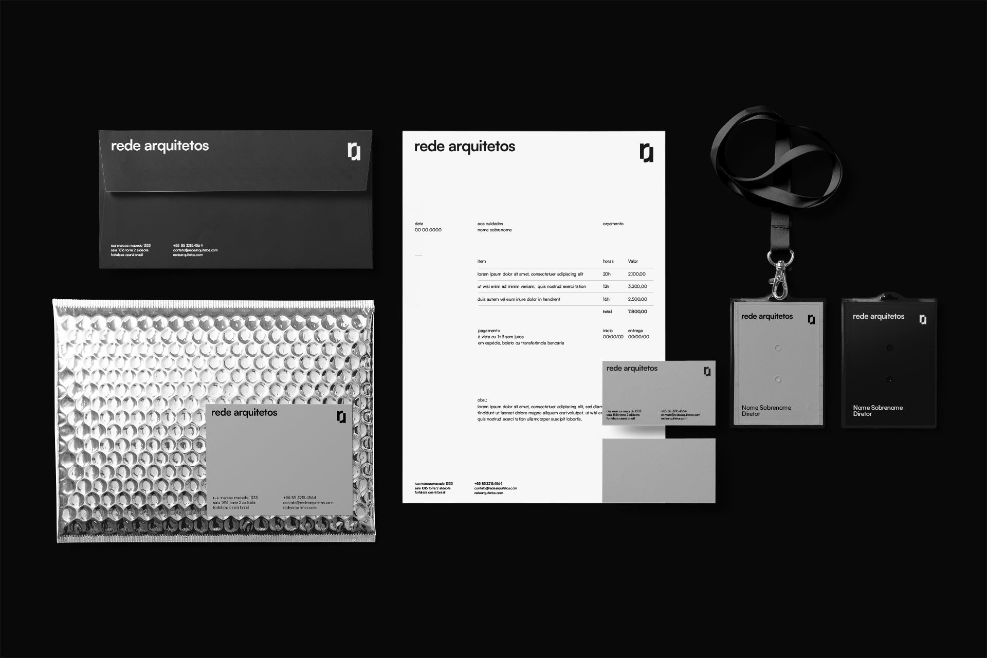
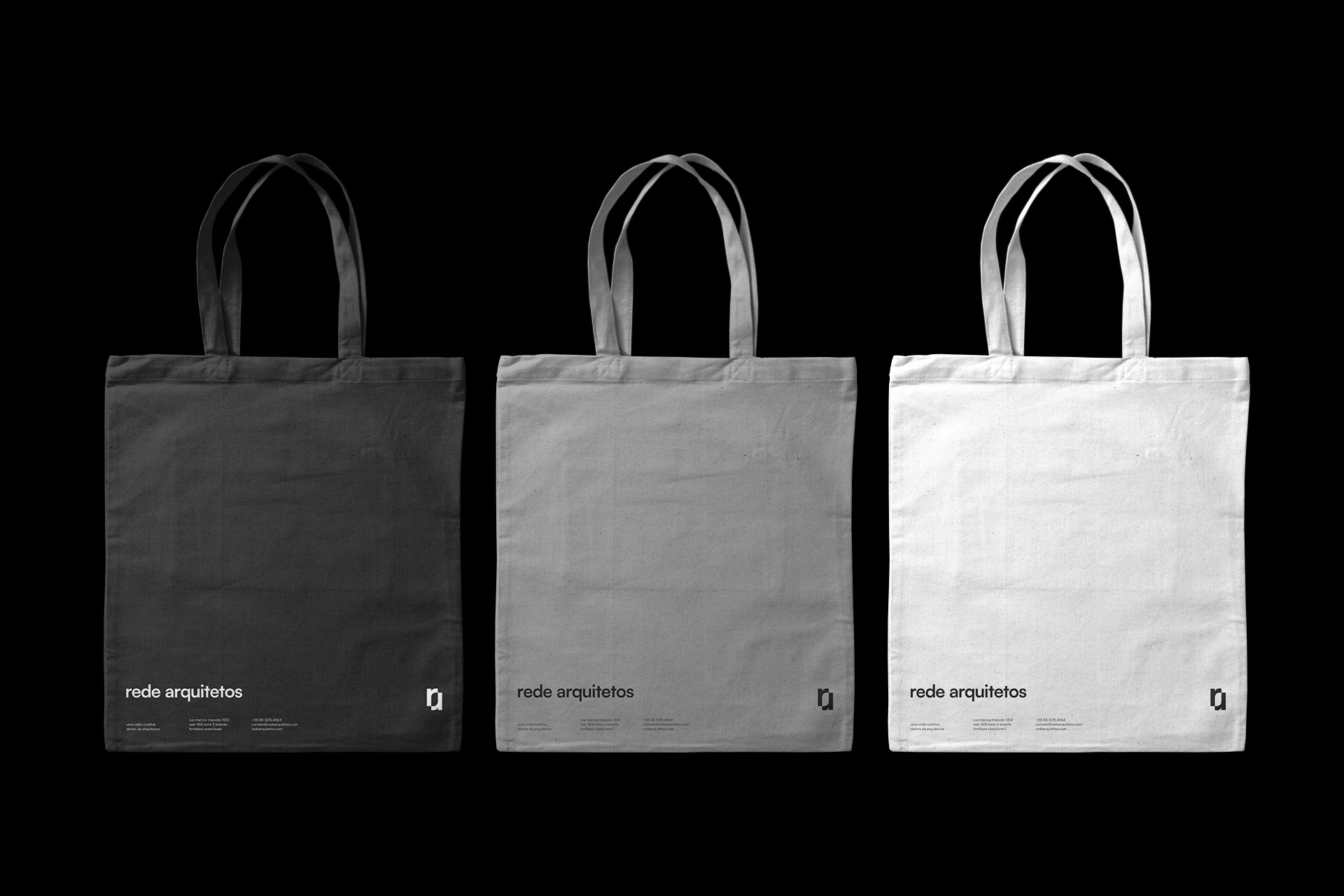
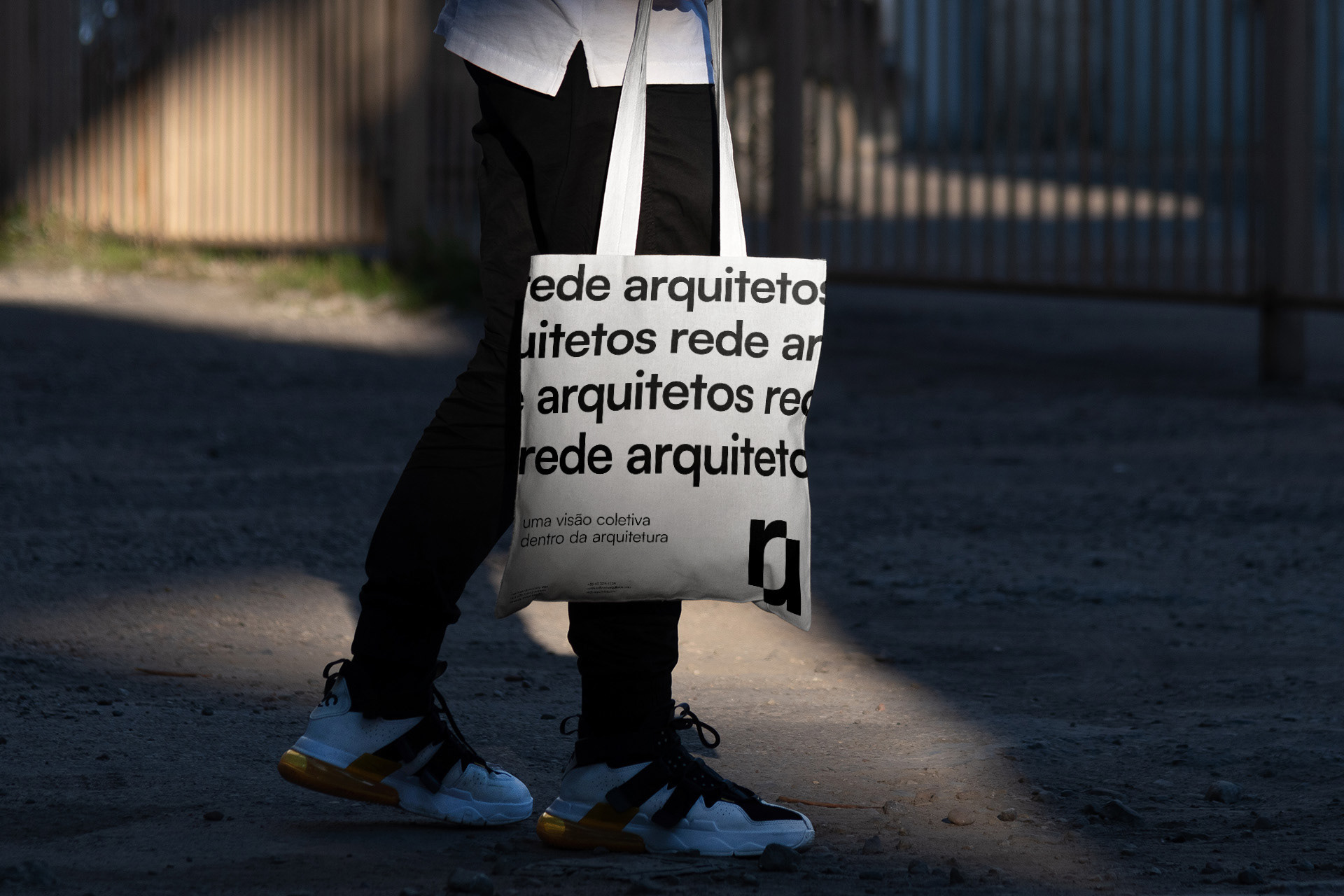
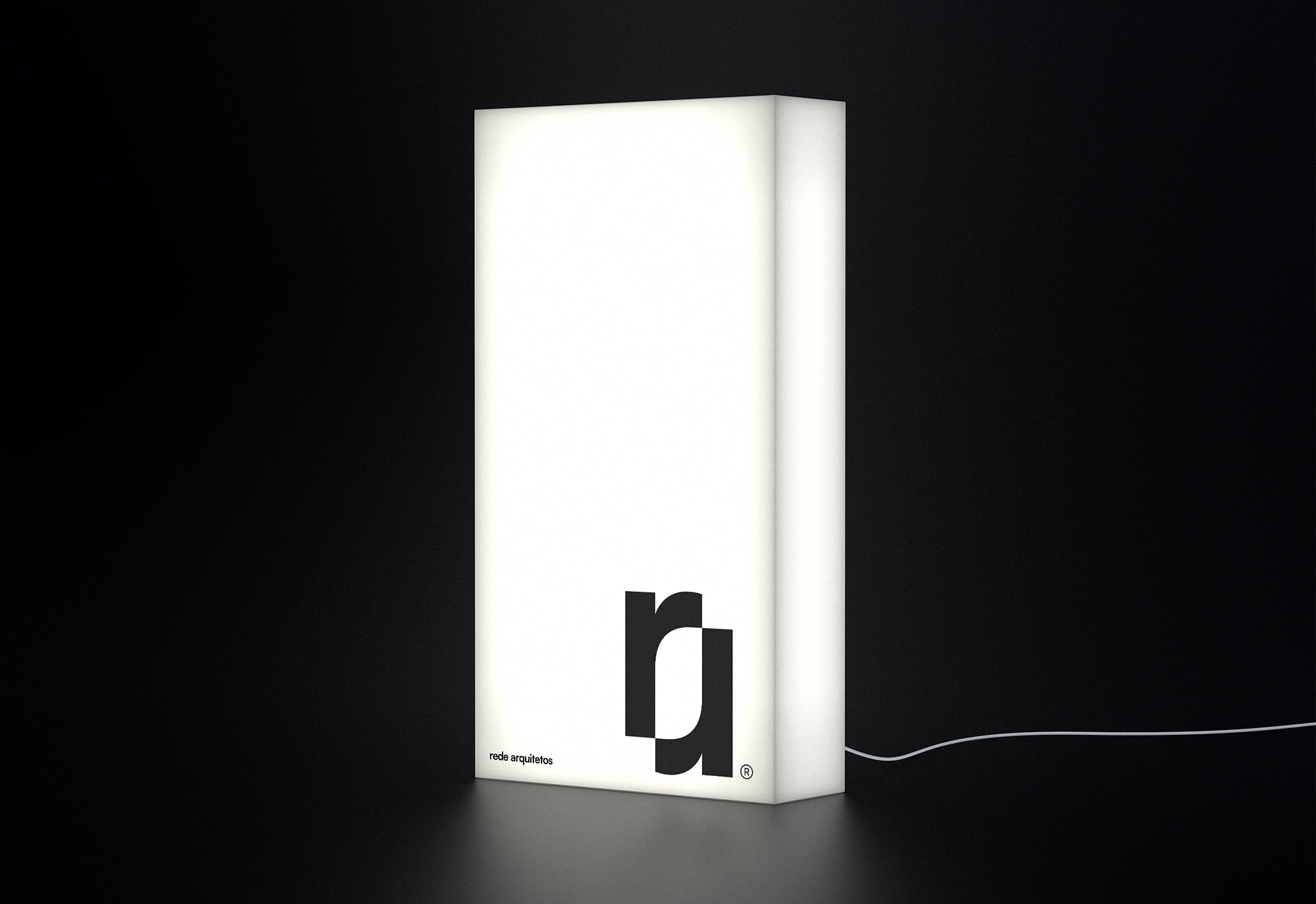
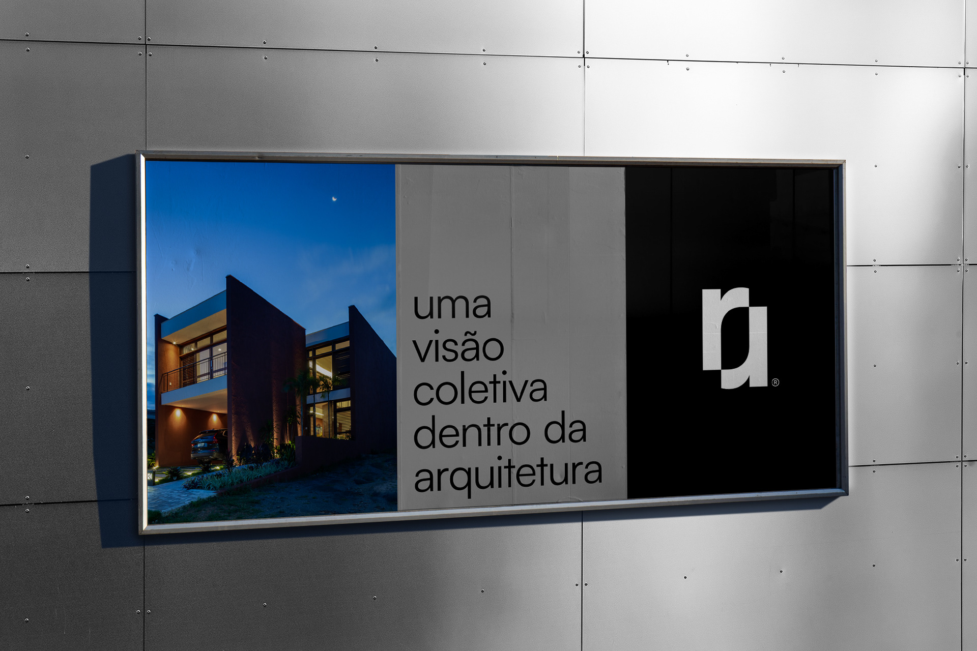
The word “Rede” (Net, Network, Mesh) in Portuguese refers to the intertwining of wires, and this concept is directly linked to the ideas of connection, collaboration and integration. With that in mind, we created a symbol that, in addition to representing the sum of the letters “R” and “A” (Rede Arquitetos), it also brings with it the ideas of synchrony, cycle, unity. It can also refer to the idea of a fragment of a network.
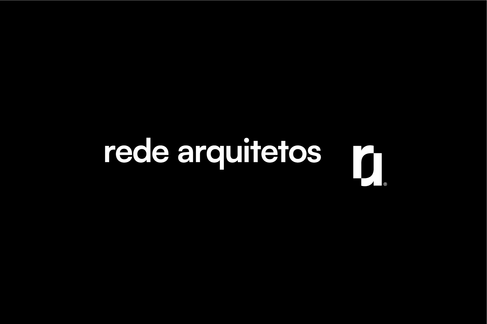
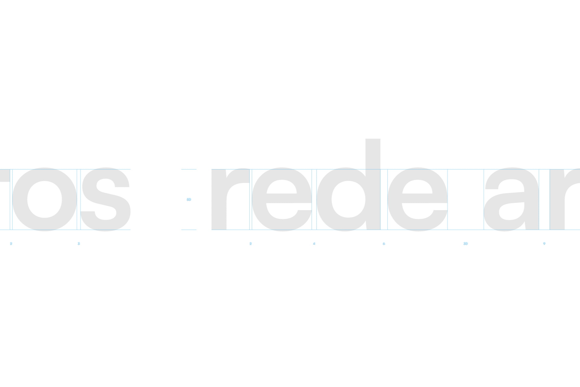
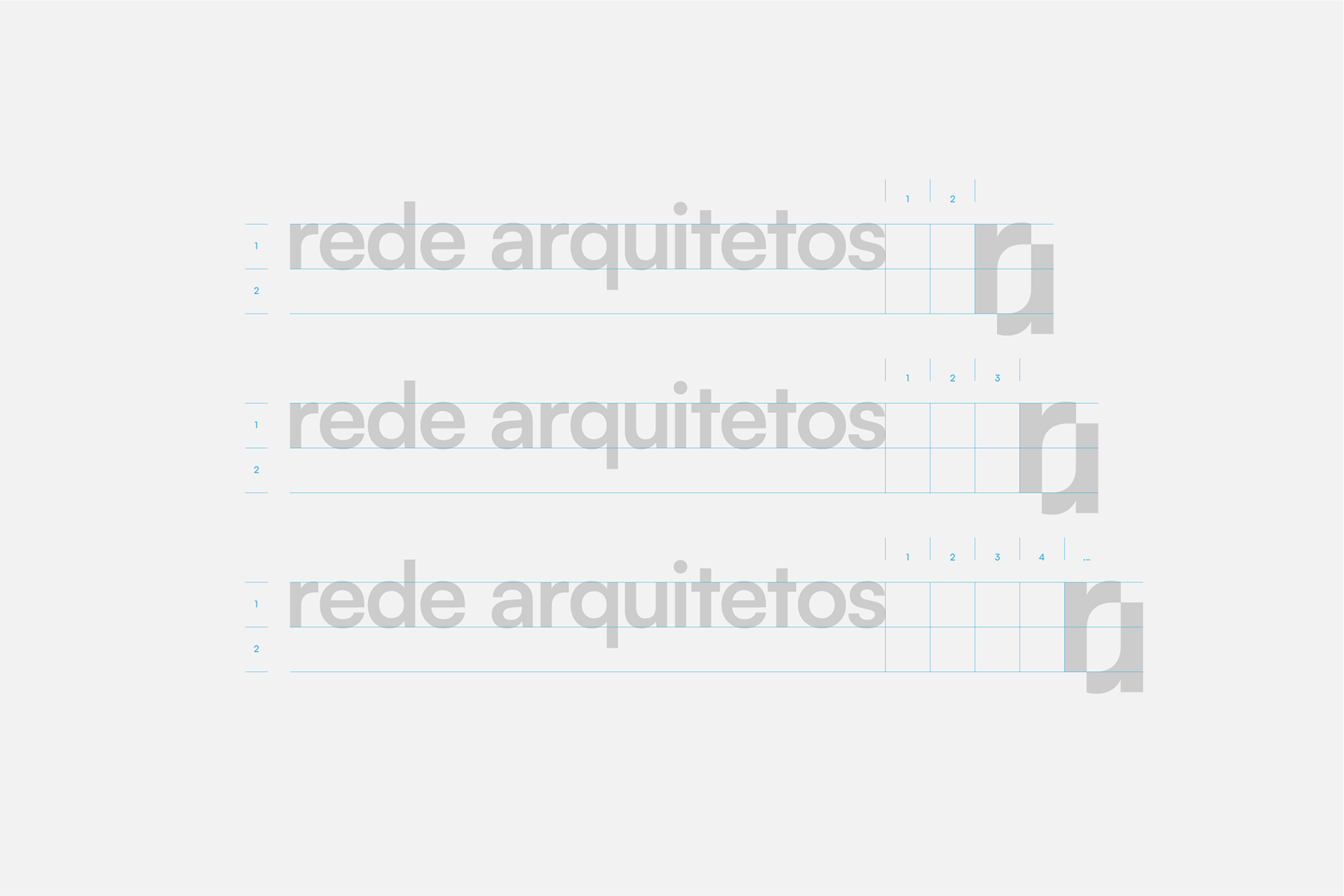
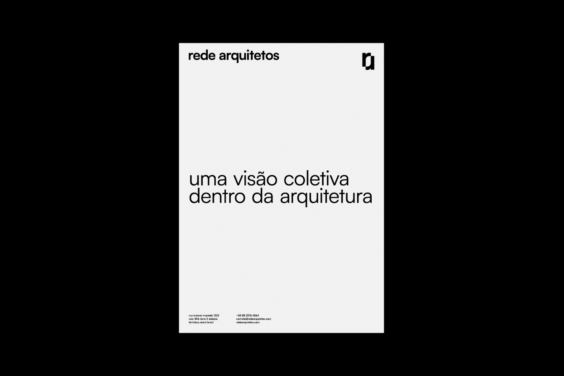
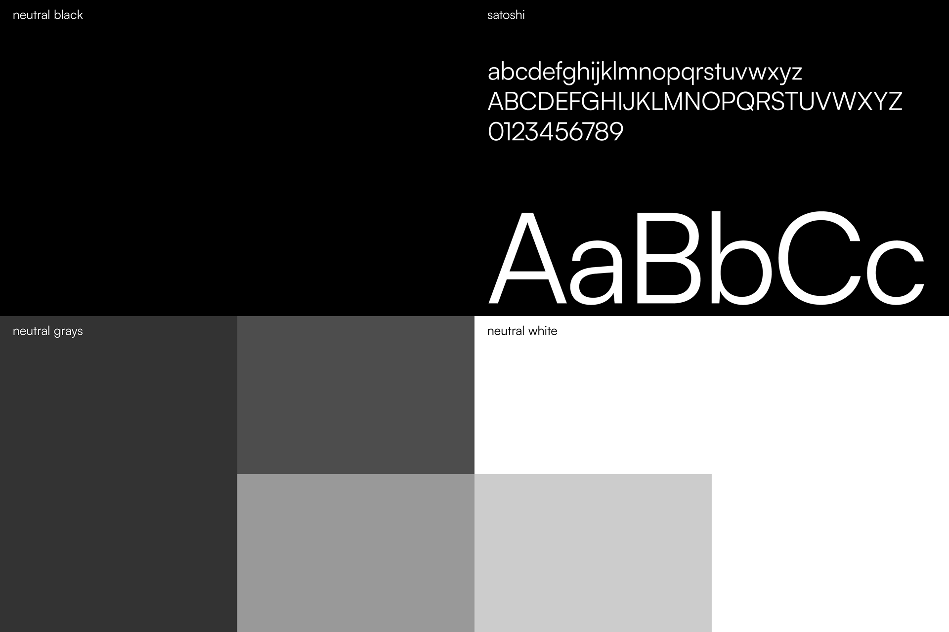
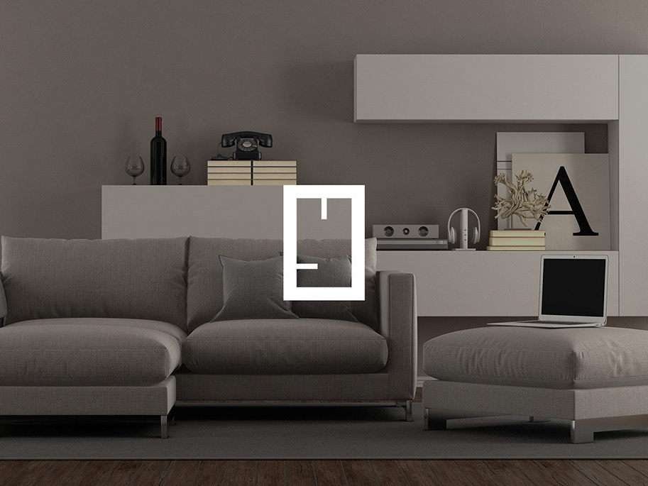
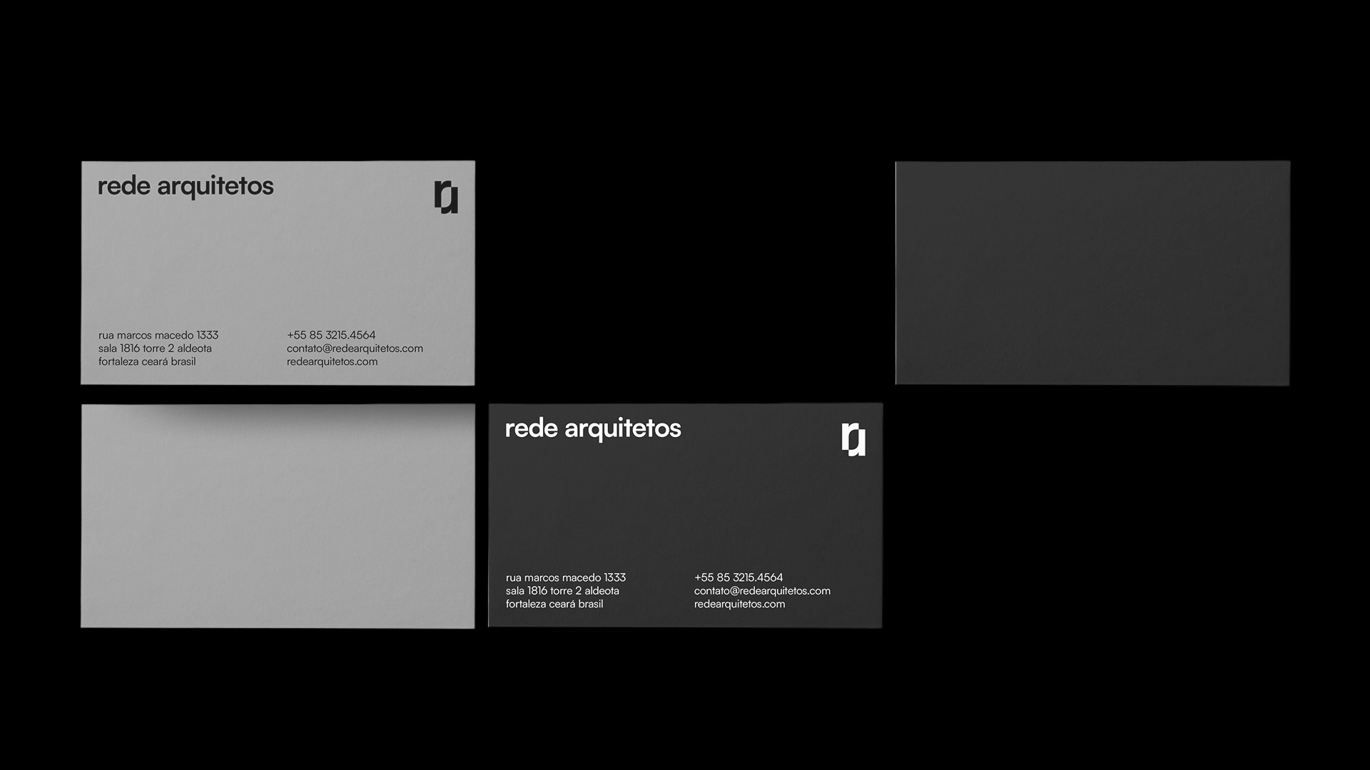
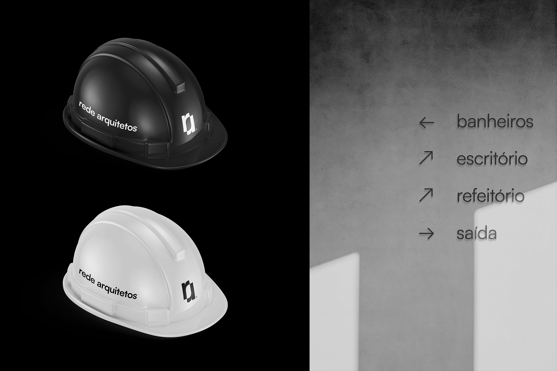
The visual identity reflects other striking features of the architects - it is minimalist and modern. The typography is intentionally more present than any other element, it is also functional, clear and intended to be friendly, and inviting. The use of empty spaces is a hallmark, as it helps bring the focus to what is really important.

Graphic Design: Walter Mattos, Iure Figueira, Cássio Podgaietsky
Architectural projects: Rede Arquitetos
Photography: Joana França [1], Igor Ribeiro [2, 3]