paiN Gaming | eSports
Brand Identity for paiN Gaming, the biggest e-Sports organization from Latin America.
The main challenge of this project was to preserve the feeling that the public already had in relation to the original brand. It was 2017, and paiN Gaming at this point was considered by many as a traditional team and very dear among its fans.
A sudden change in the visual brand would be considered risky.
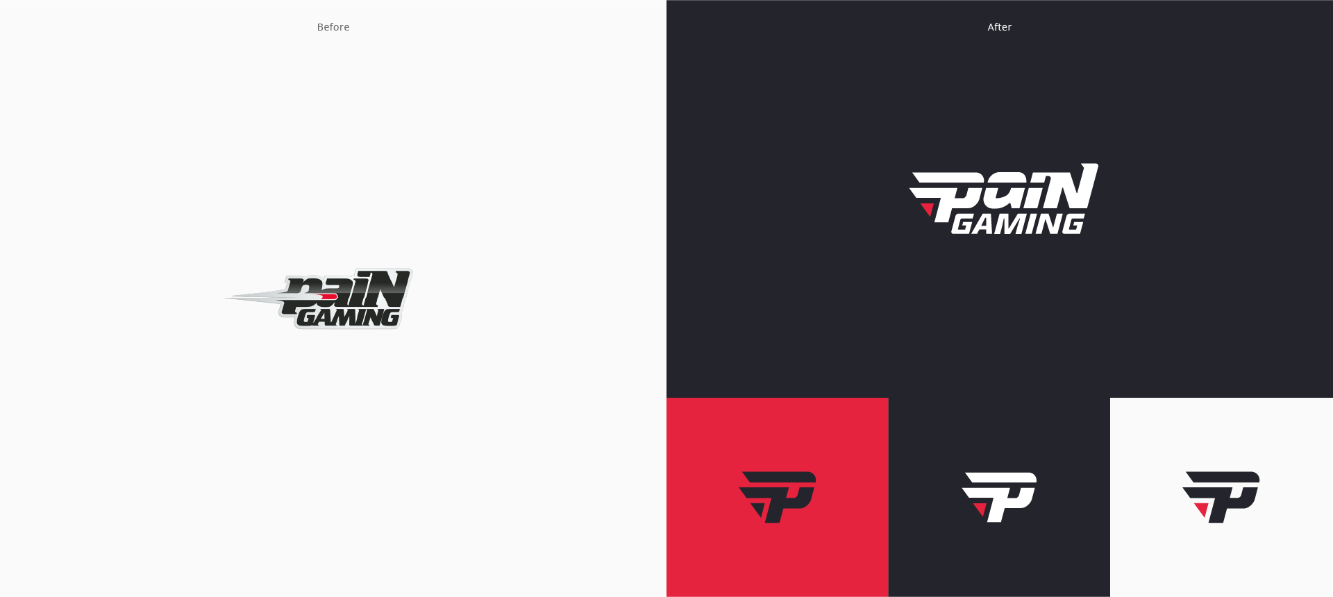
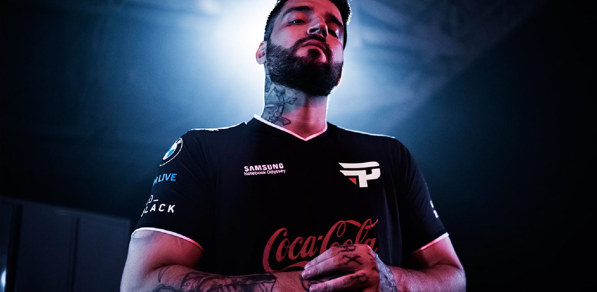
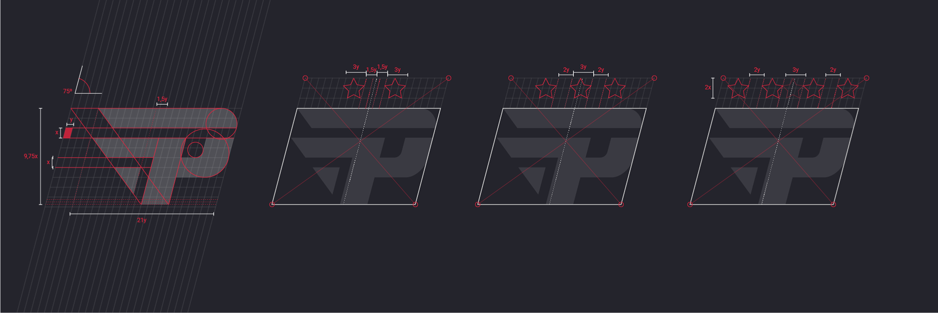
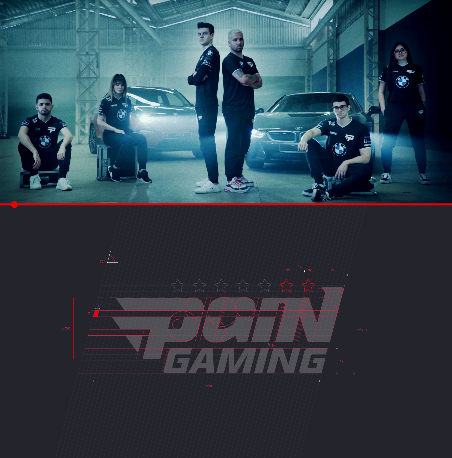
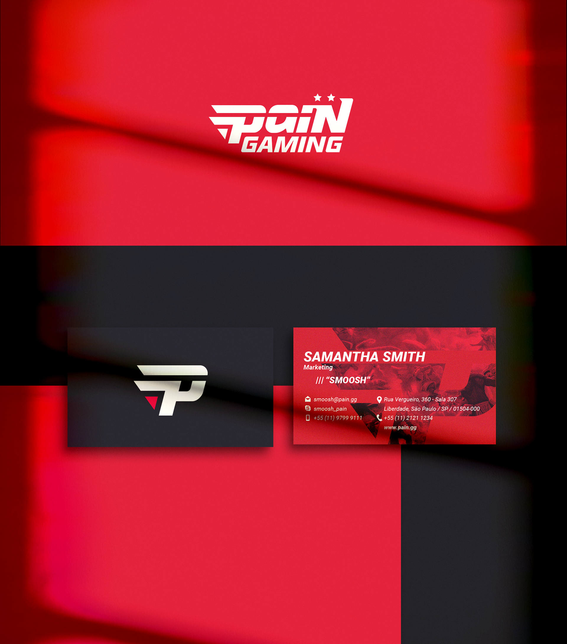
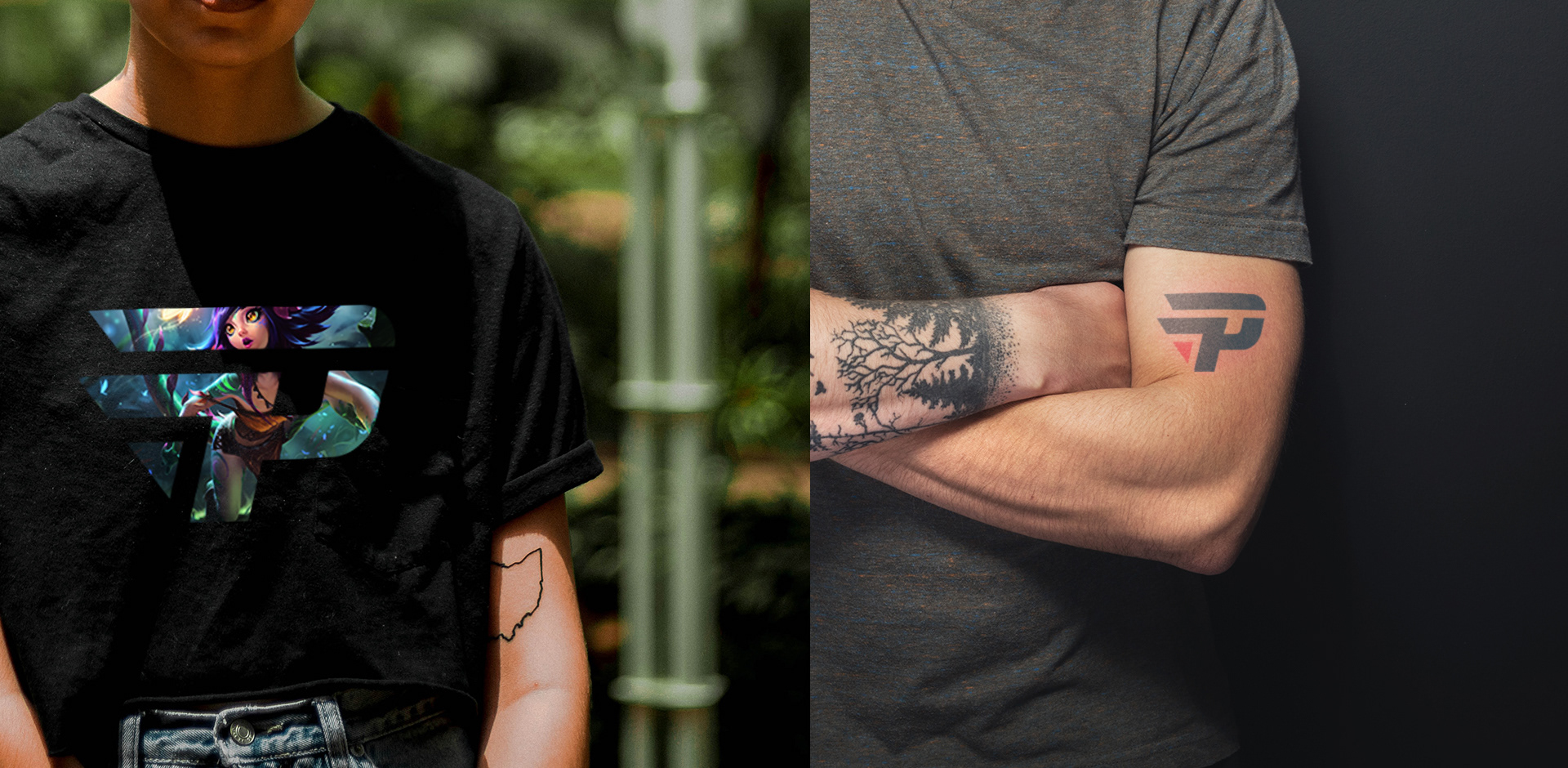
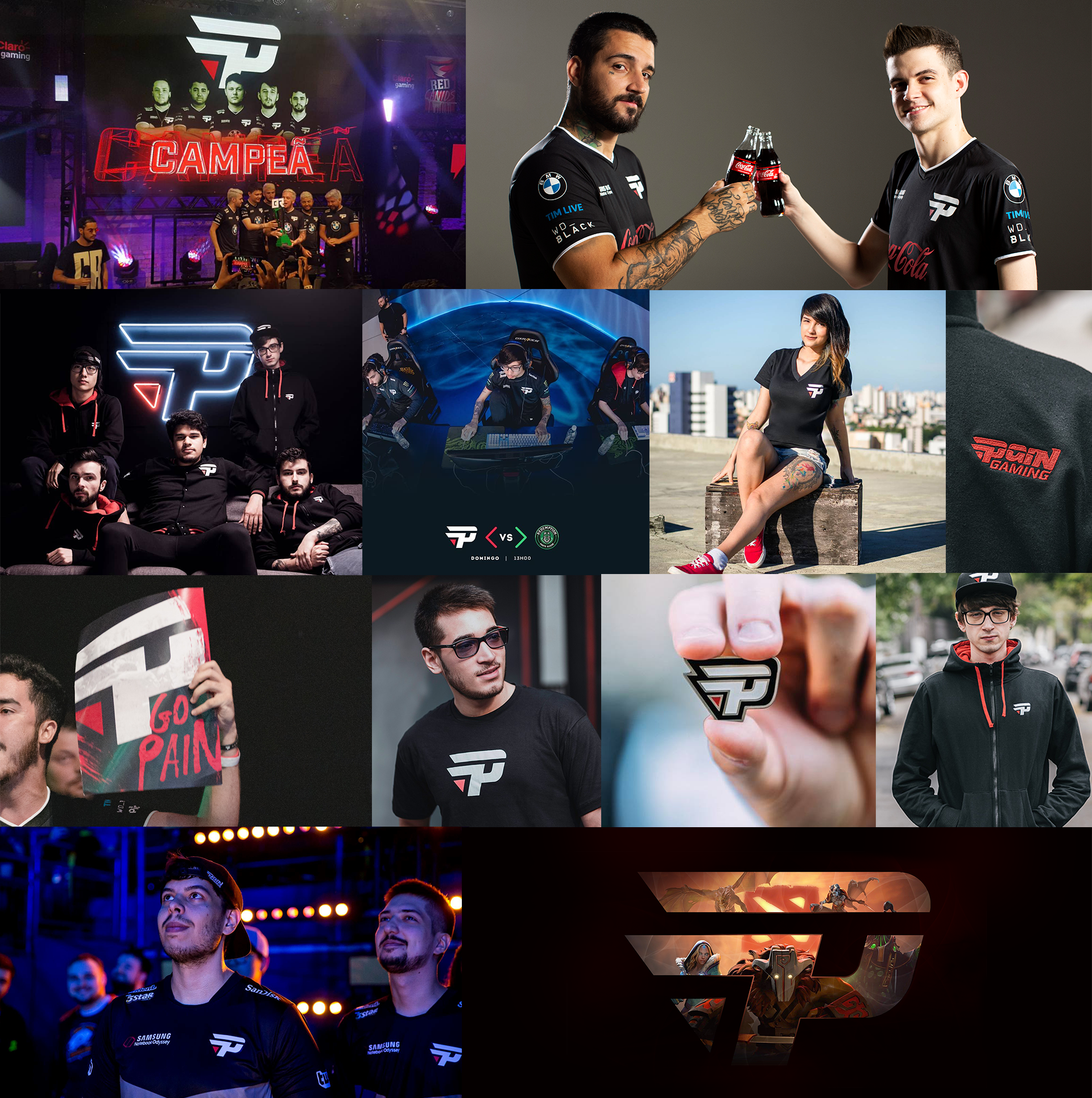
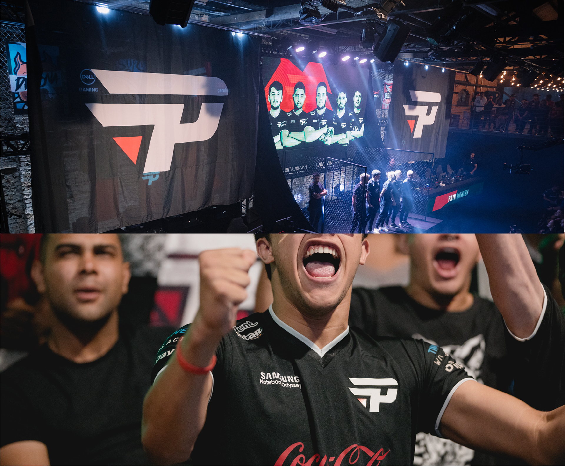
The "P", part of the logotype itself, was designed to become the symbol of the brand. Today it is the protagonist, appearing in all applications and products of the paiN Gaming store including, in addition to the traditional t-shirt, products such as key chains, caps, pins and pants.
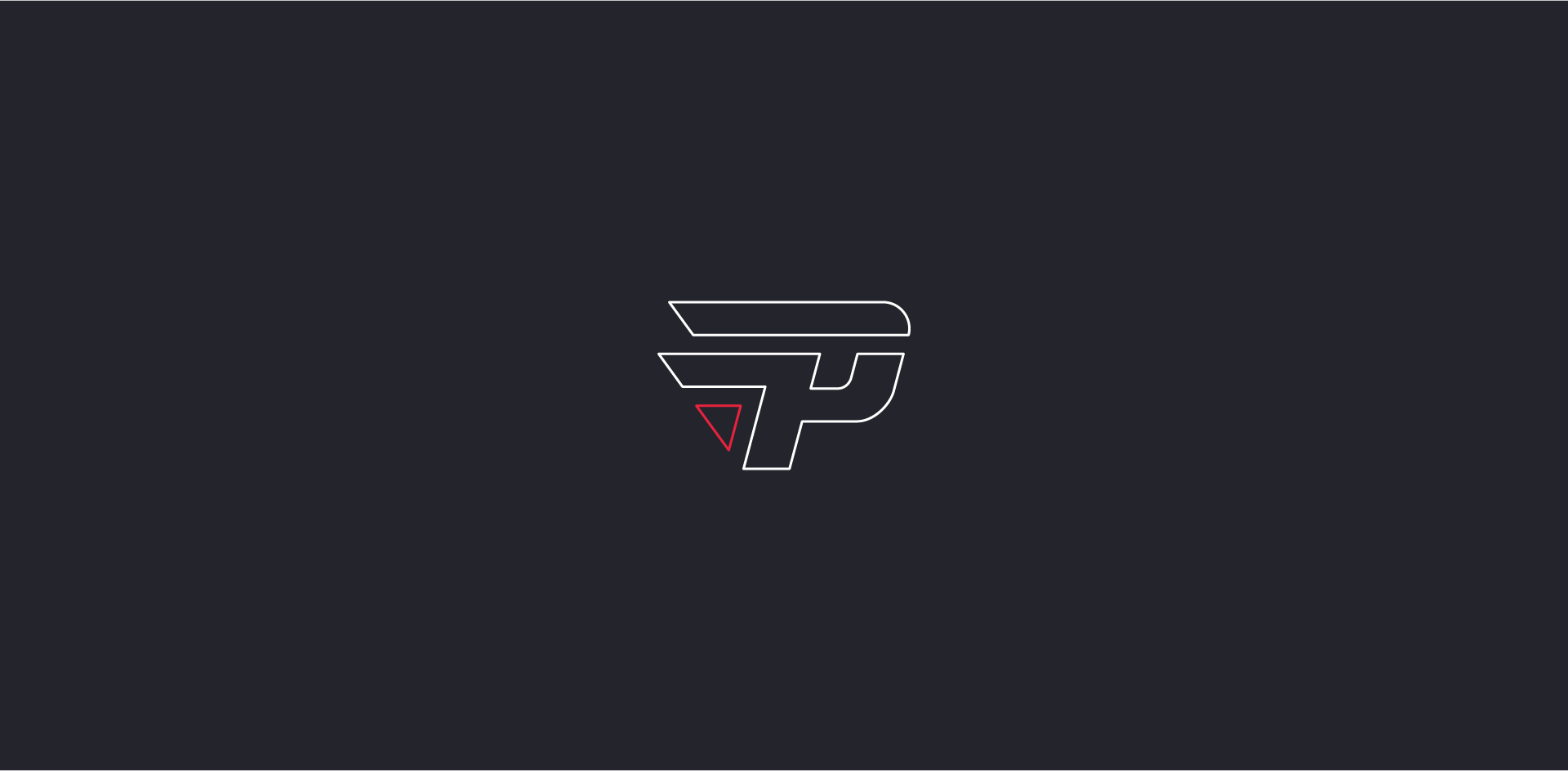
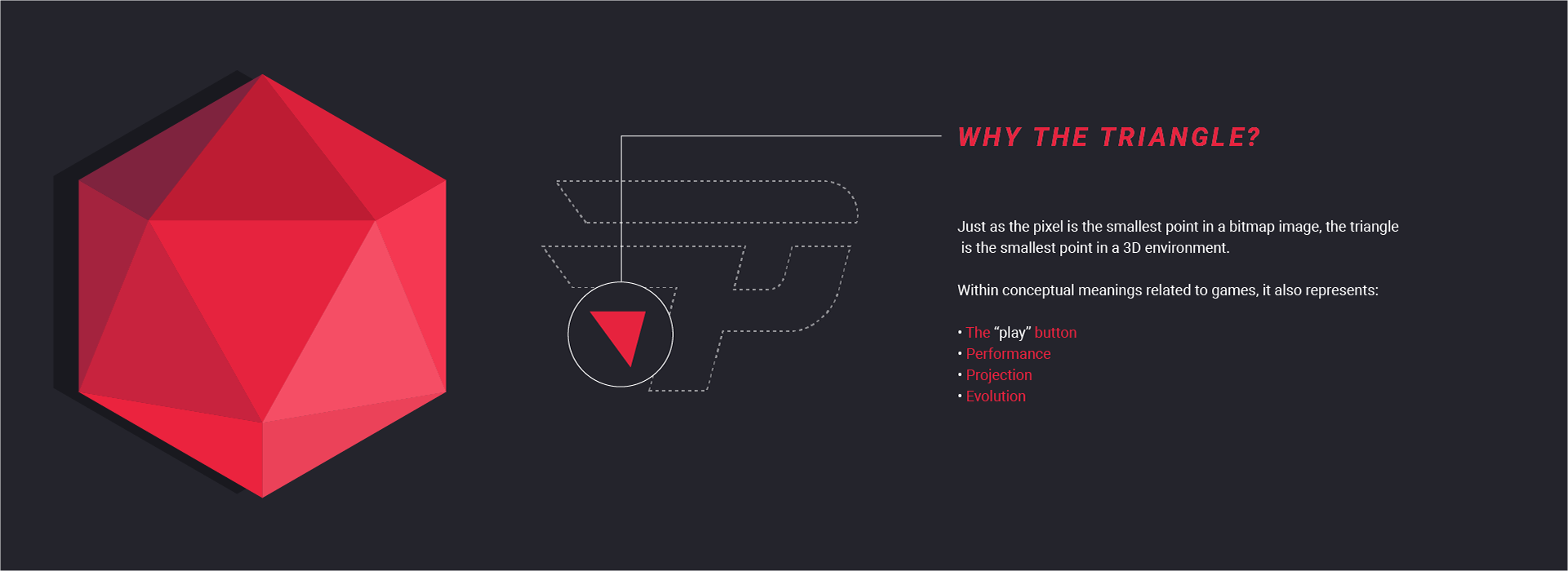
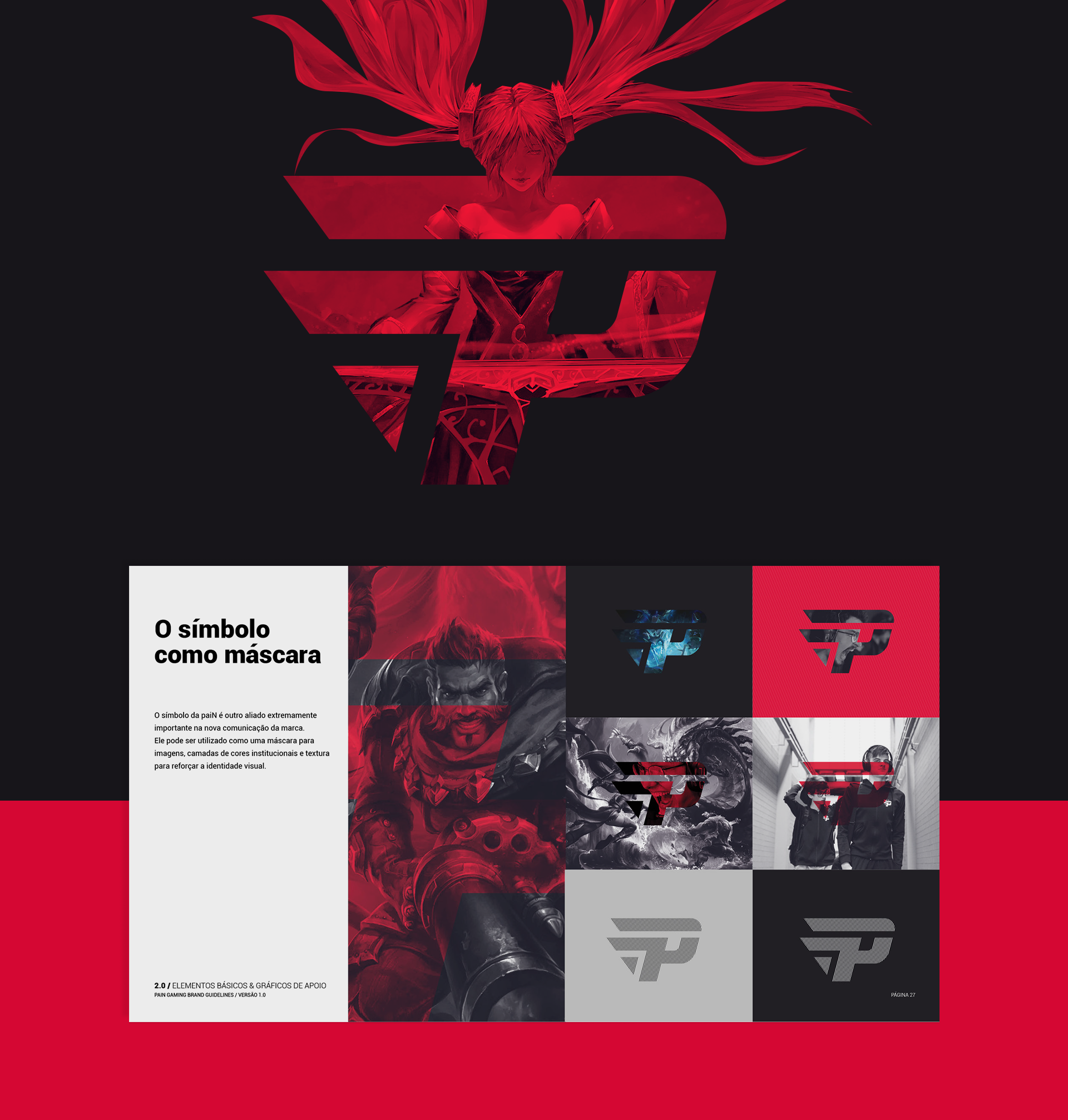
The bullet trail of the original brand no longer represented the fundamental concept of the team, which did not only have FPS game teams at this point. For this reason, the bullet gave way to the triangle - an element that, conceptually, represents ideas such as: play, performance, projection and evolution.

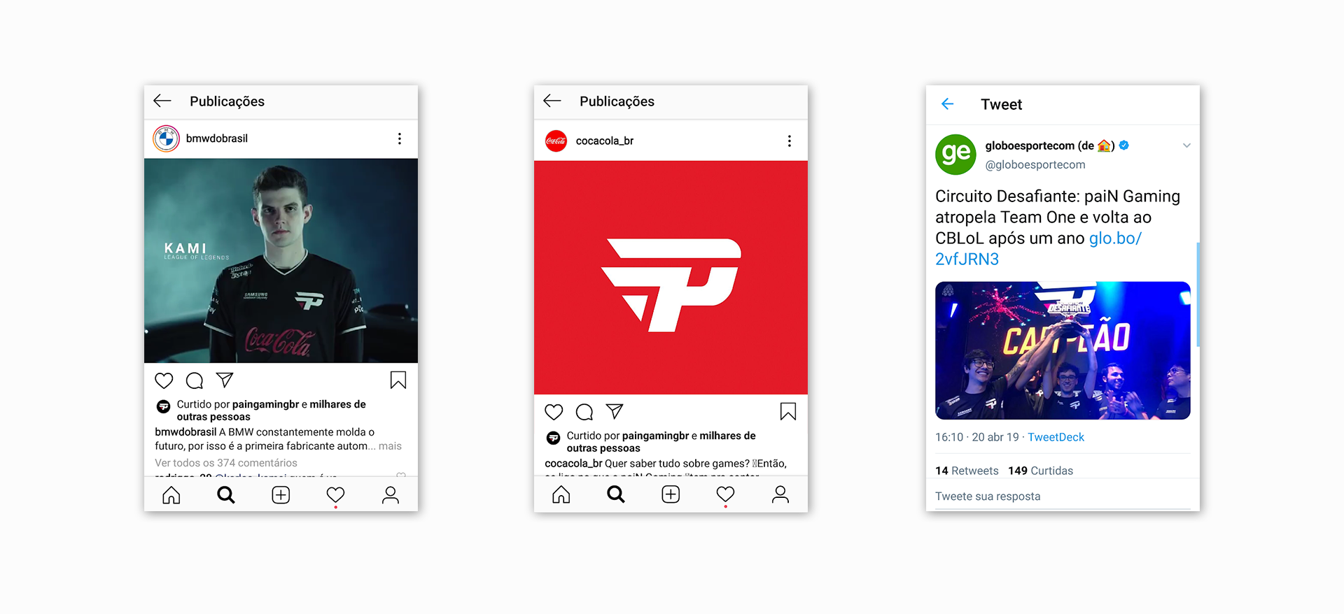
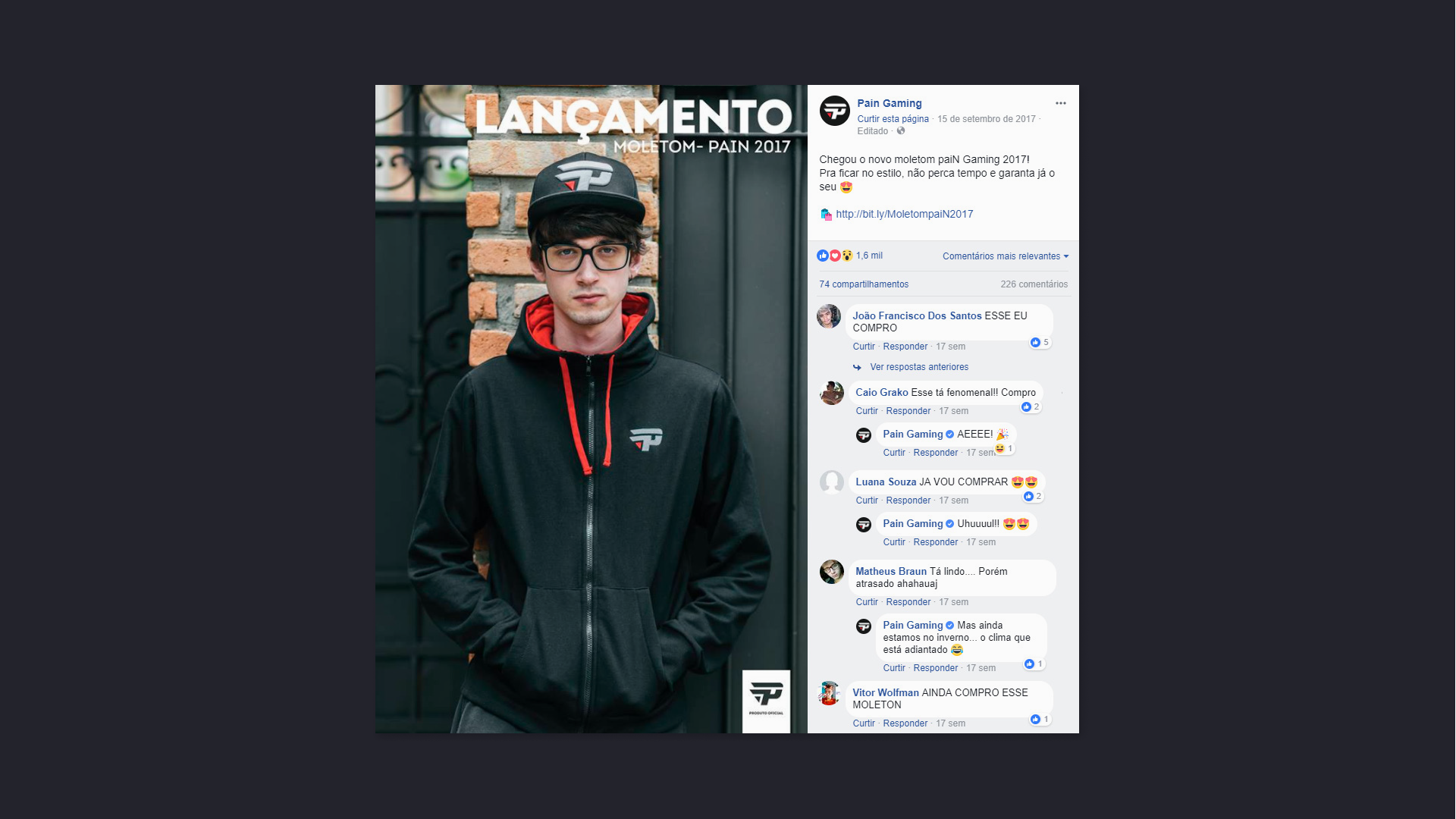
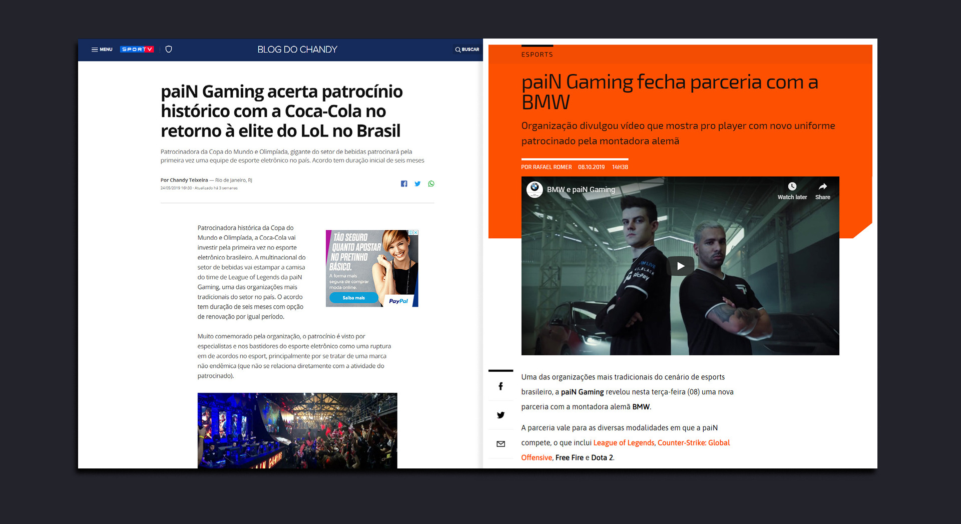
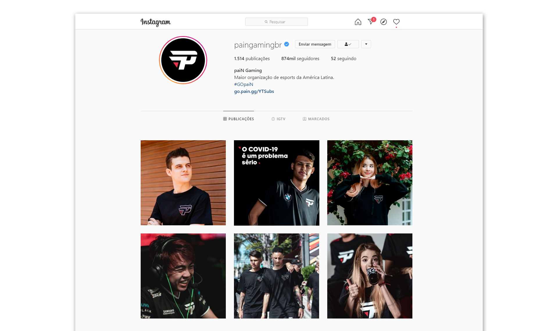
Today the brand continues to grow and paiN's internal team does a great job expanding the universe of the new design. The fans are conected to the new branding, and it reinforces trust with its partners and sponsors such as Samsung, Coca-Cola and BMW, for example.
Design Direction
Walter Mattos
Walter Mattos
Design Development
Walter Mattos, Felipe Perobeli, Iure Figueira
Walter Mattos, Felipe Perobeli, Iure Figueira
Photos
paiN Gaming, Riot, BBL
paiN Gaming, Riot, BBL