About
Jestor is a no-code platform for businesses with complex processes based in San Francisco, California, with a global presence. In 2022, I was brought on board to assist with creating a new visual identity for the company as part of their repositioning efforts. The goal was to launch a new website and system and improve brand perception to attract more paying clients.
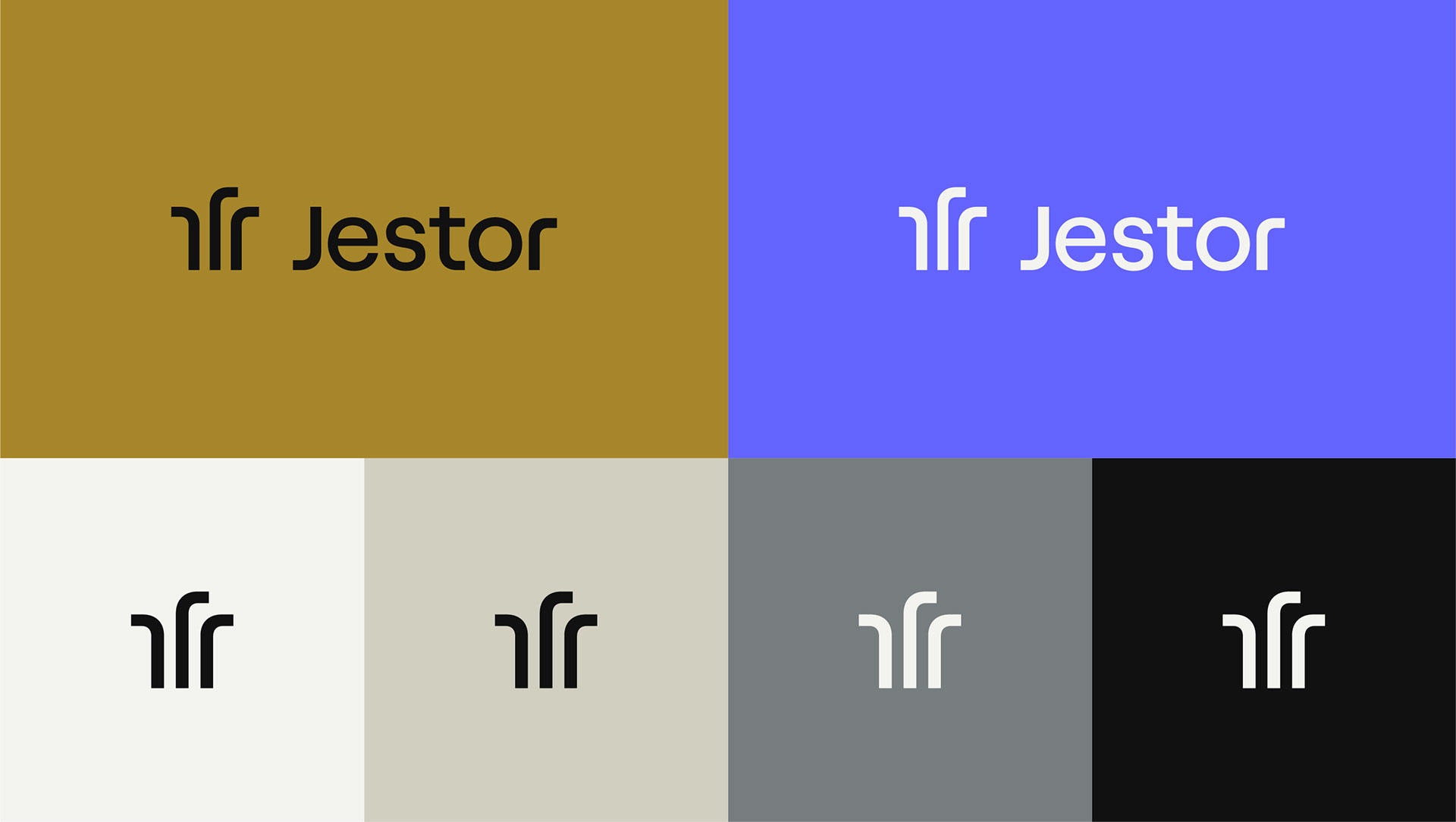
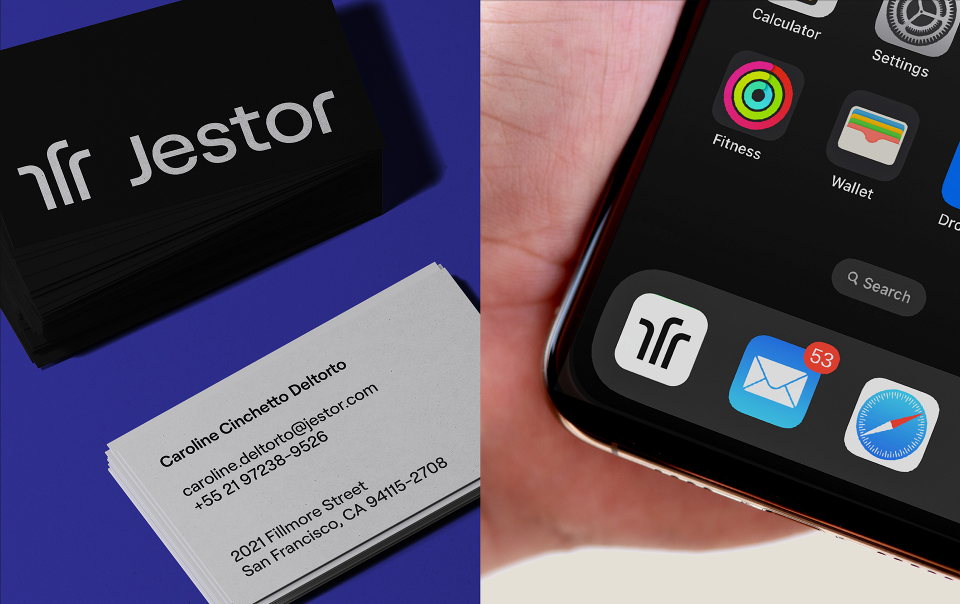
The name Jestor served as a major source of inspiration for the design. In Portuguese, Jestor is spelled similarly to "gestor," which means manager or executive in English. In English, Jestor sounds similar to "jester," a figure who wore their own crown and was one of the few members of the court who could speak freely without punishment. The jester, like Jestor, was a master of many skills.
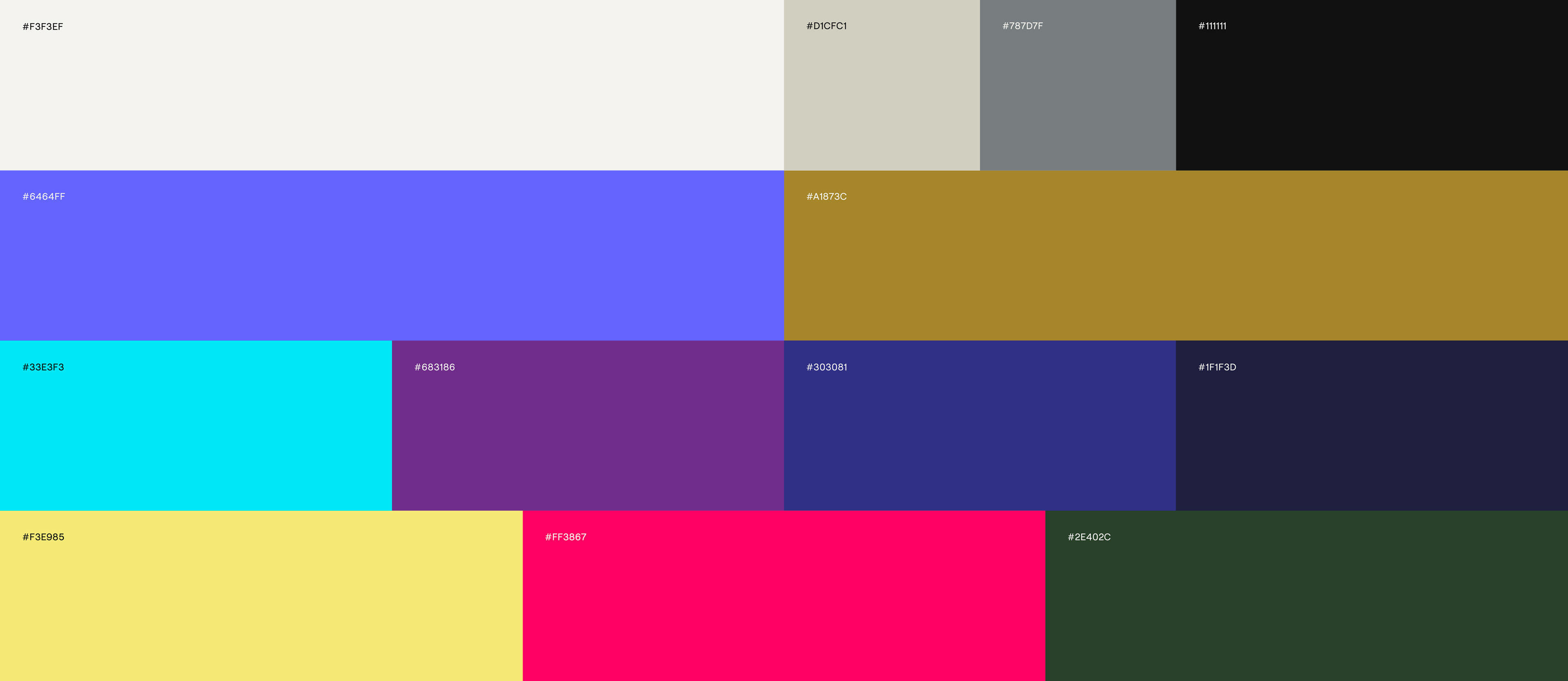
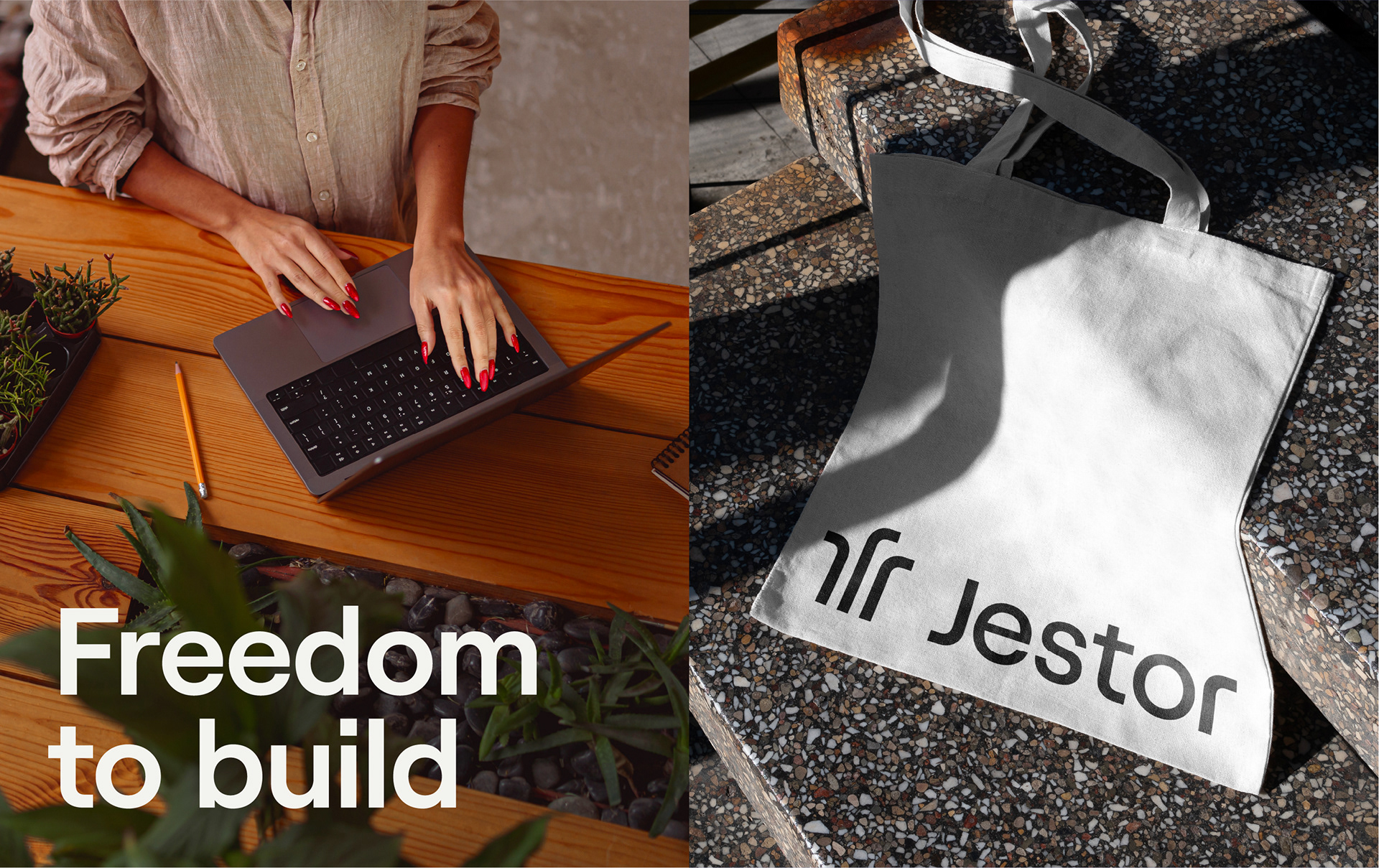
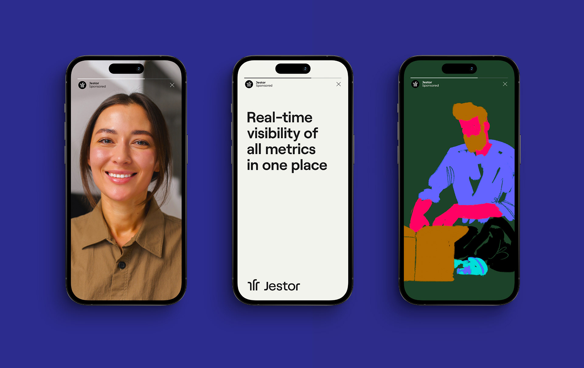
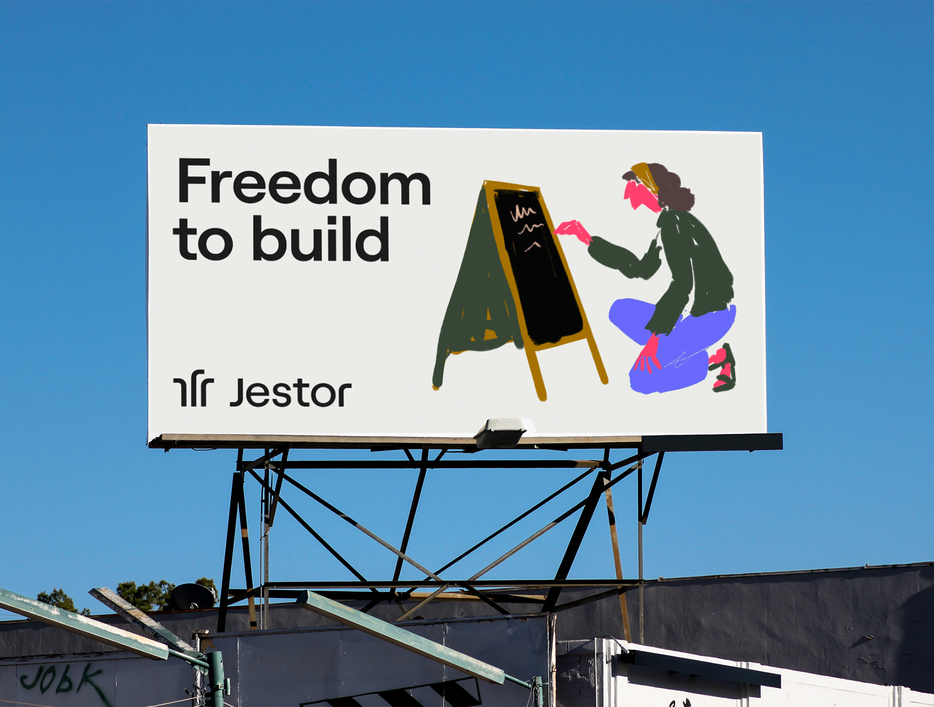
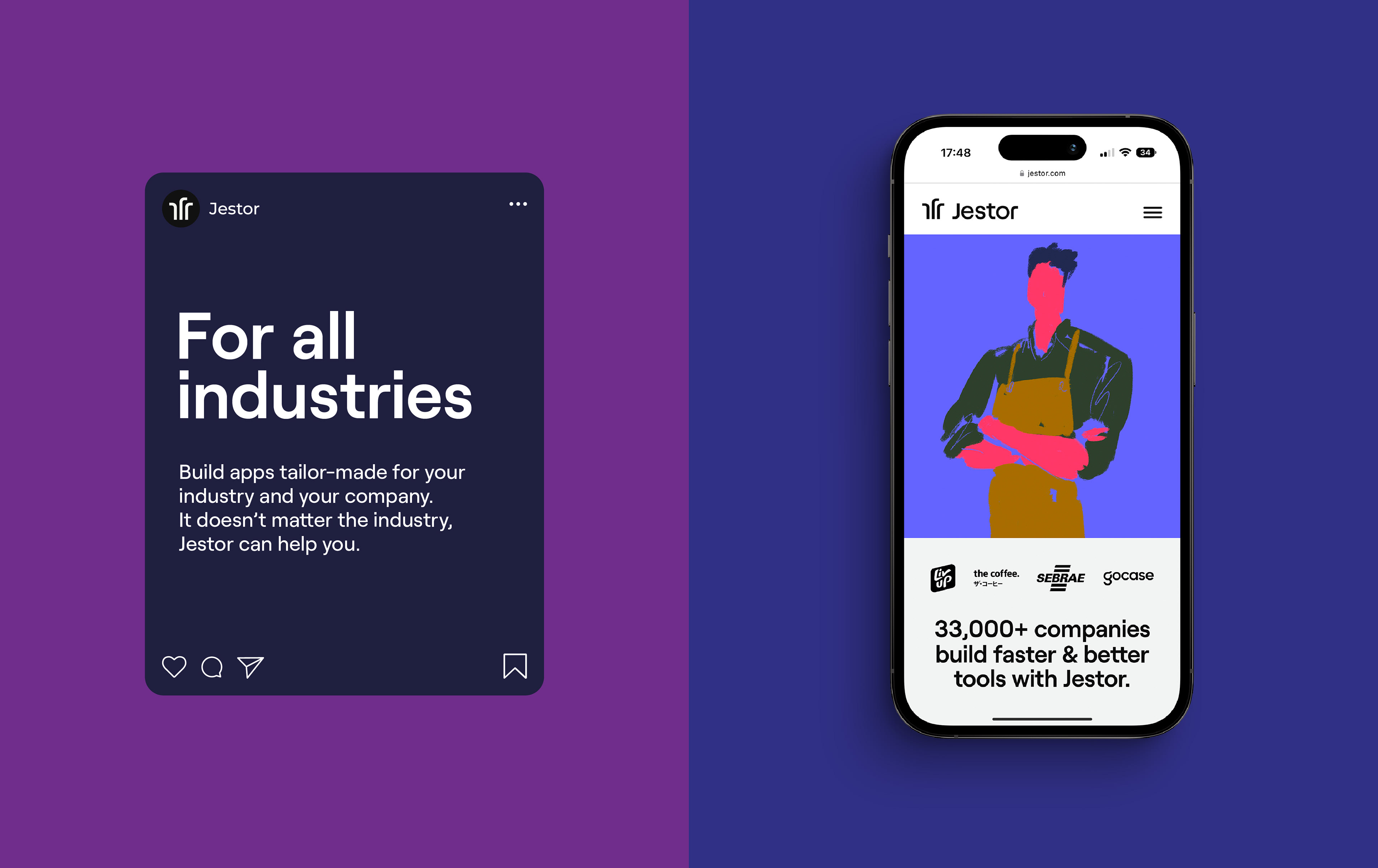
The brand design drew inspiration from the figure of the jester. The "J" served as the basic concept for the symbol, representing the jester's crown and the different possibilities and paths enabled by Jestor. The visual identity conveys traits such as lightness, proactivity, and innovation, depicted through a clean, slightly relaxed, yet highly professional language.


©2022 Jestor
Design Direction: Walter Mattos
Design: Walter Mattos, Gabriel M. Ramos and Iure Figueira
Strategy: Walter Mattos, Iure Figueira
Motion: Bruno Krazler
Illustration: Atipo