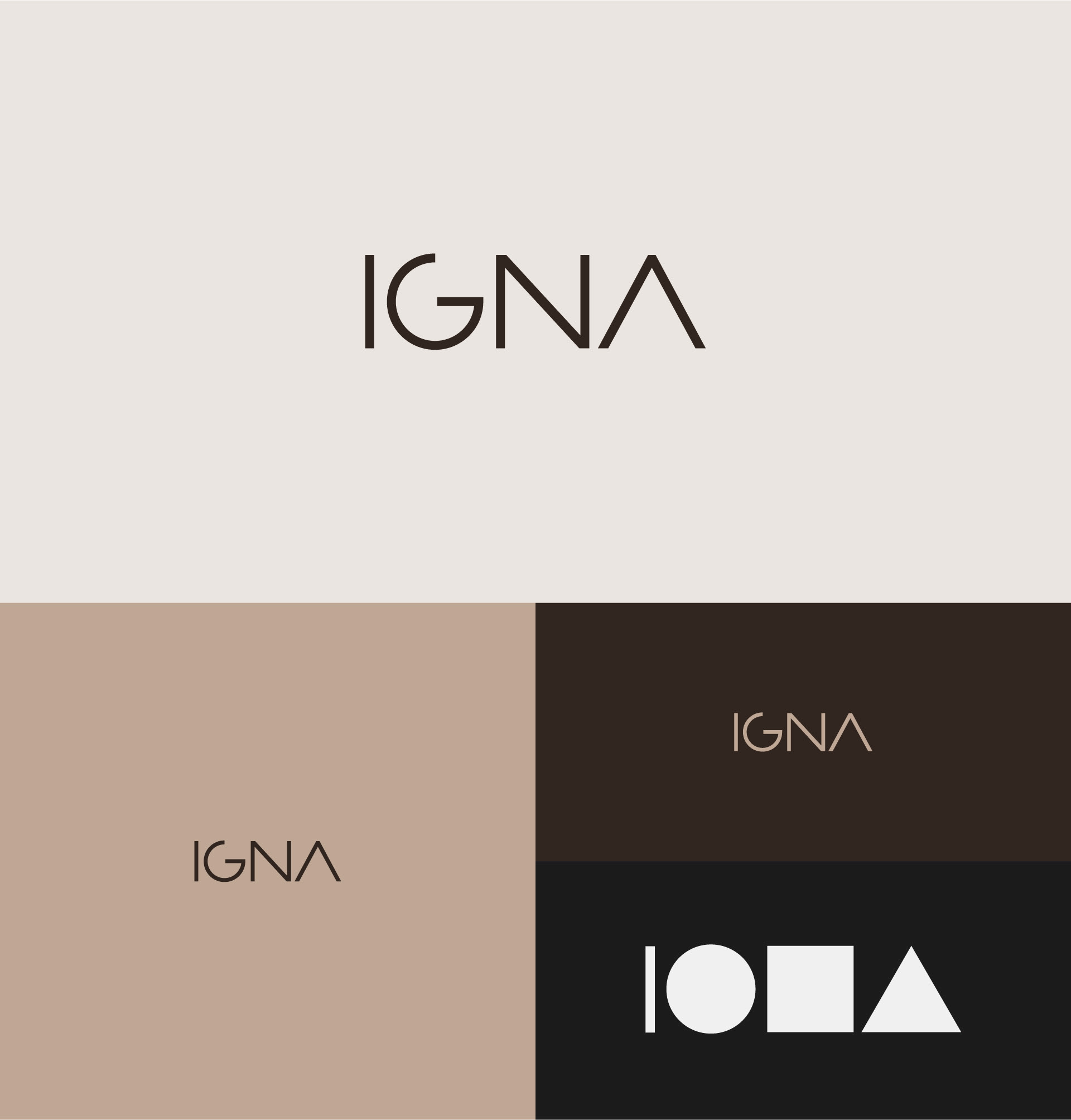
IGNA Arquitetura
Naming and Visual Identity for IGNA, one of the companies of Ricardo Pamplona, an architect with over 25 years of experience specialized in functional and automated solutions for residential and commercial projects.
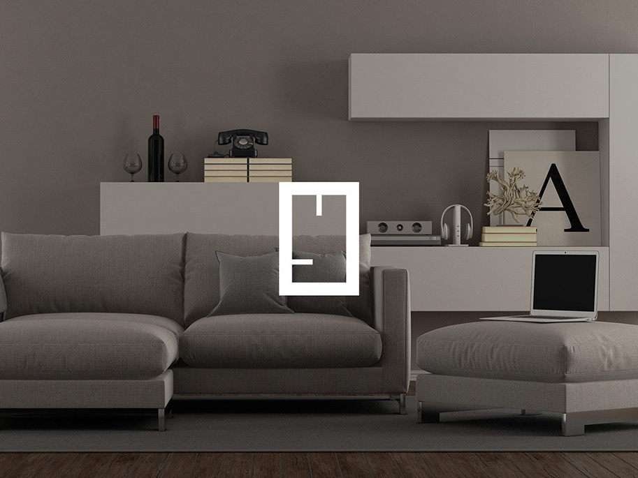
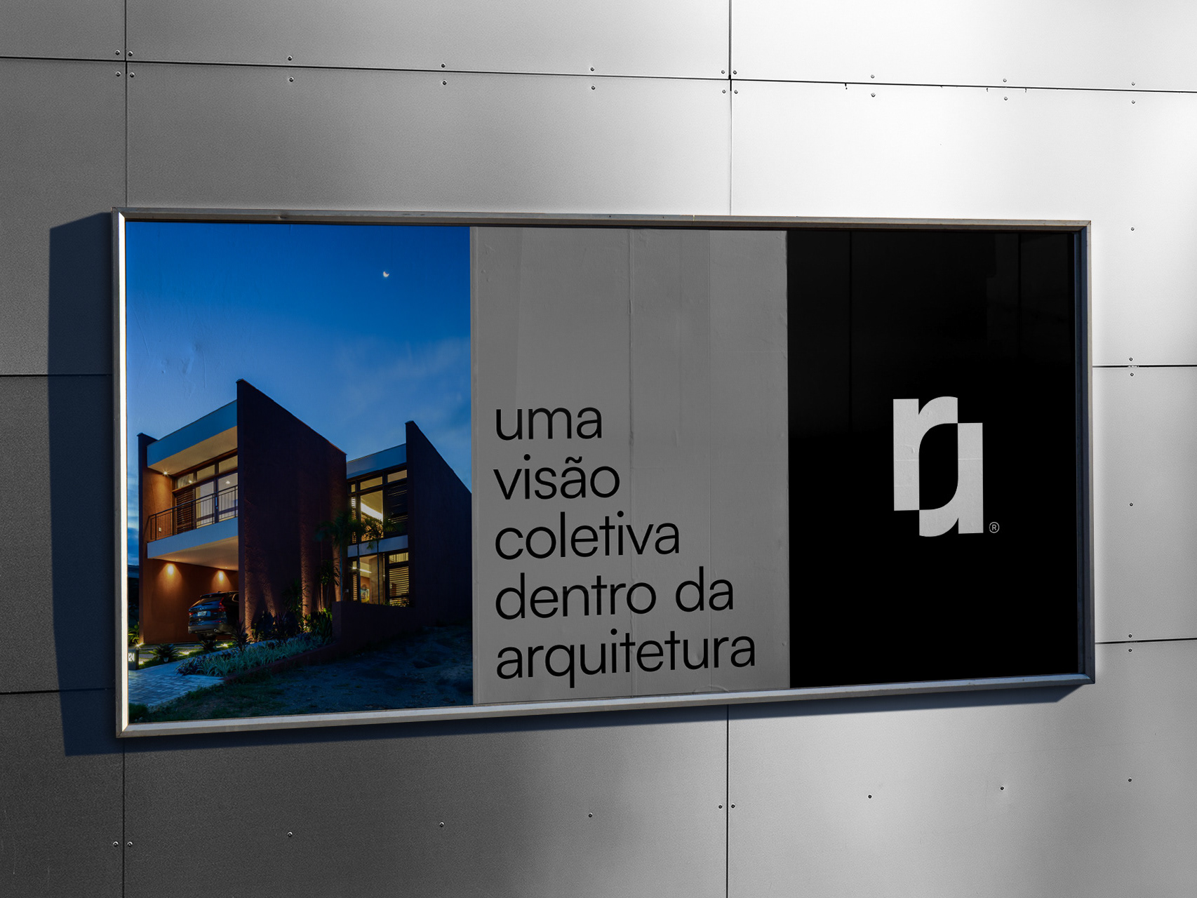
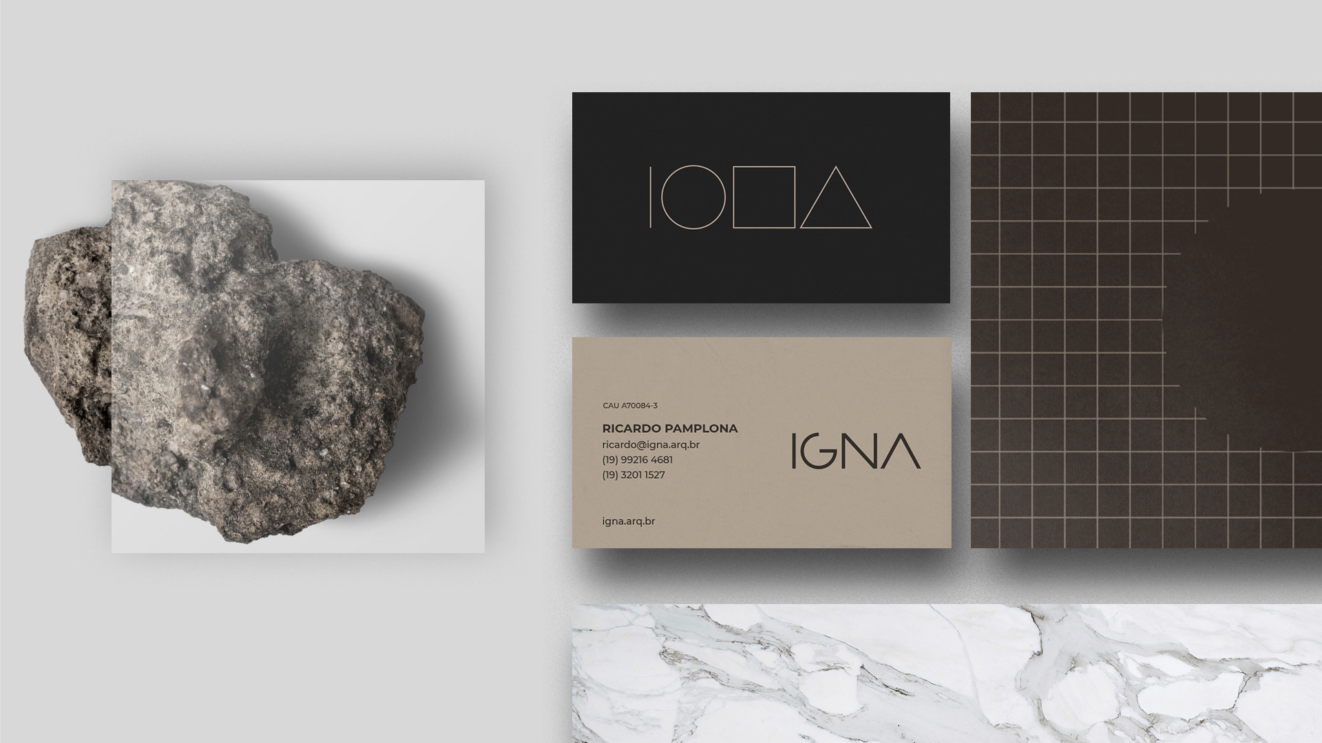
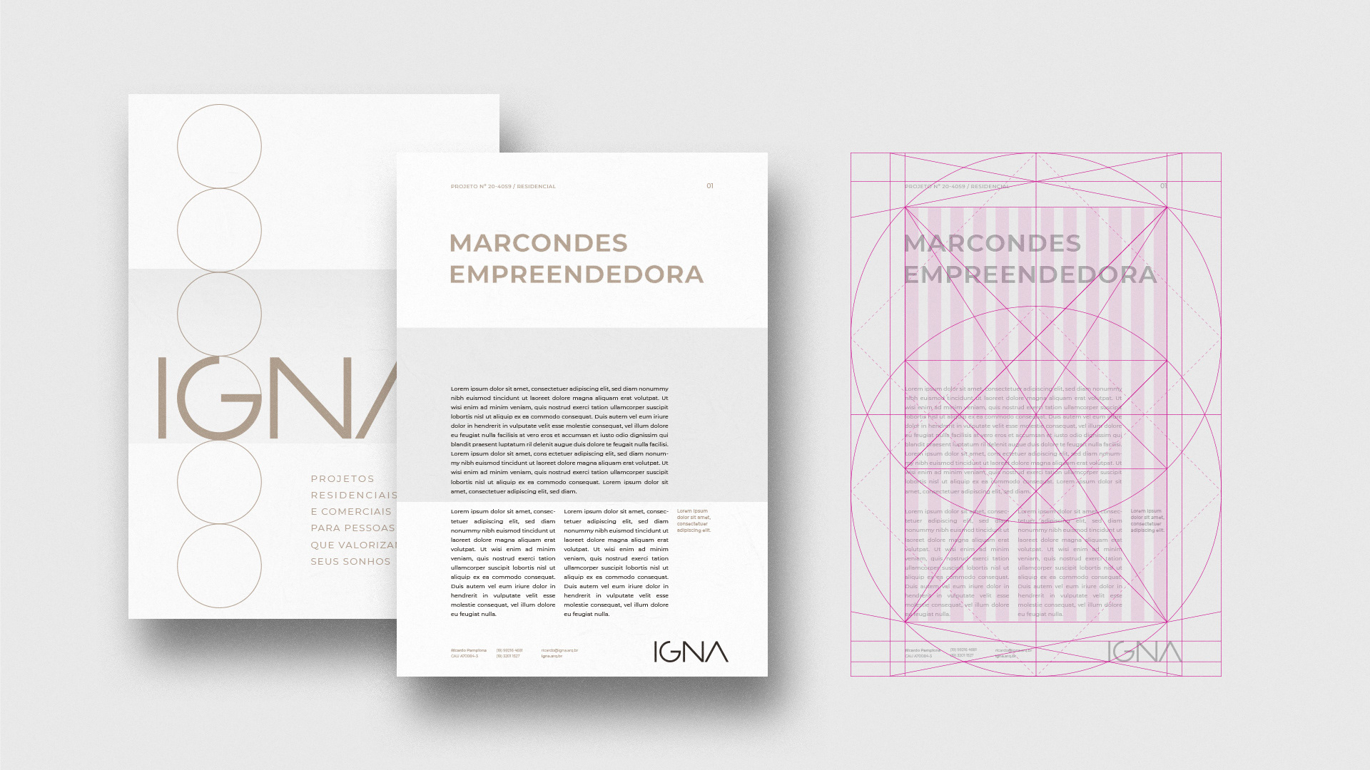
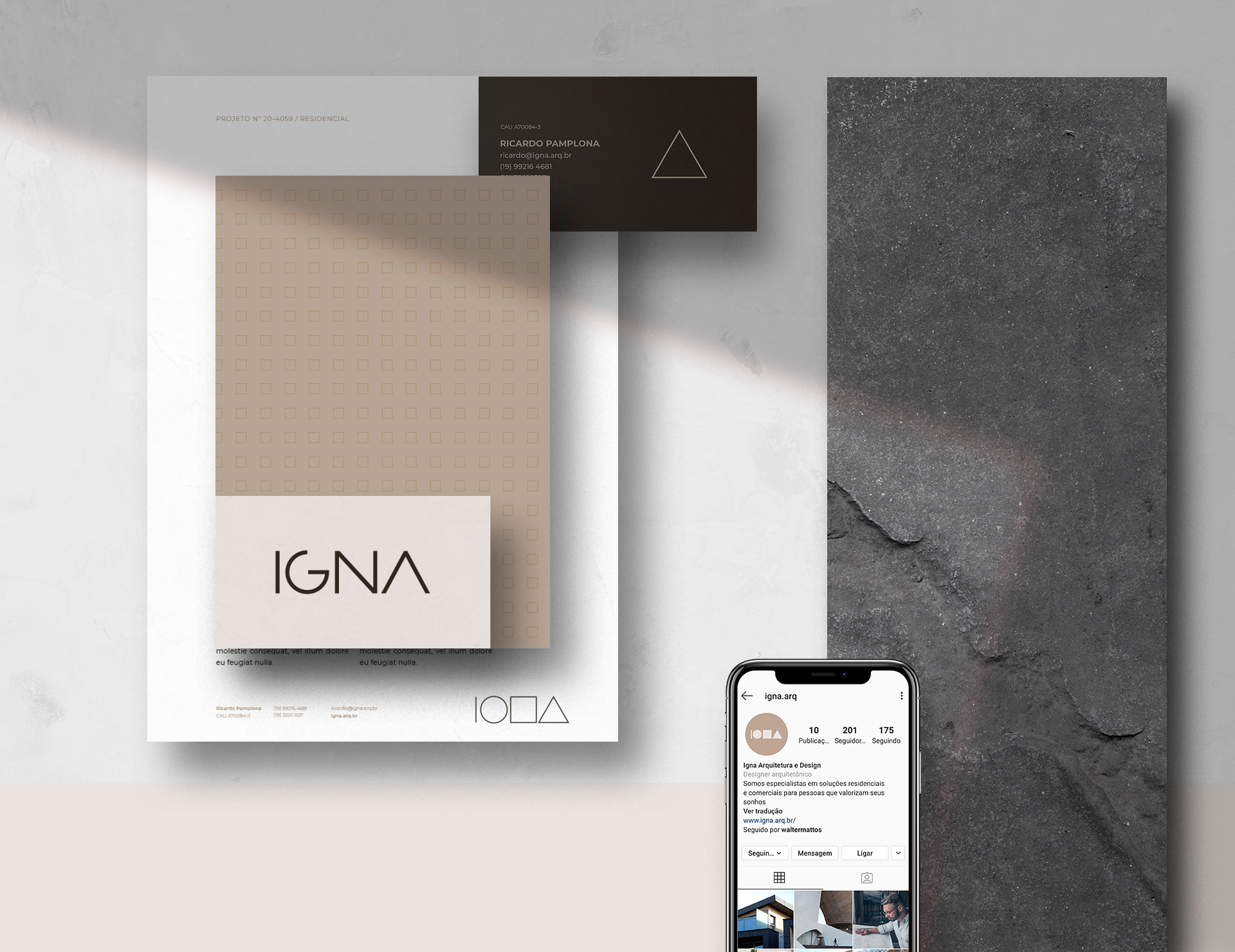
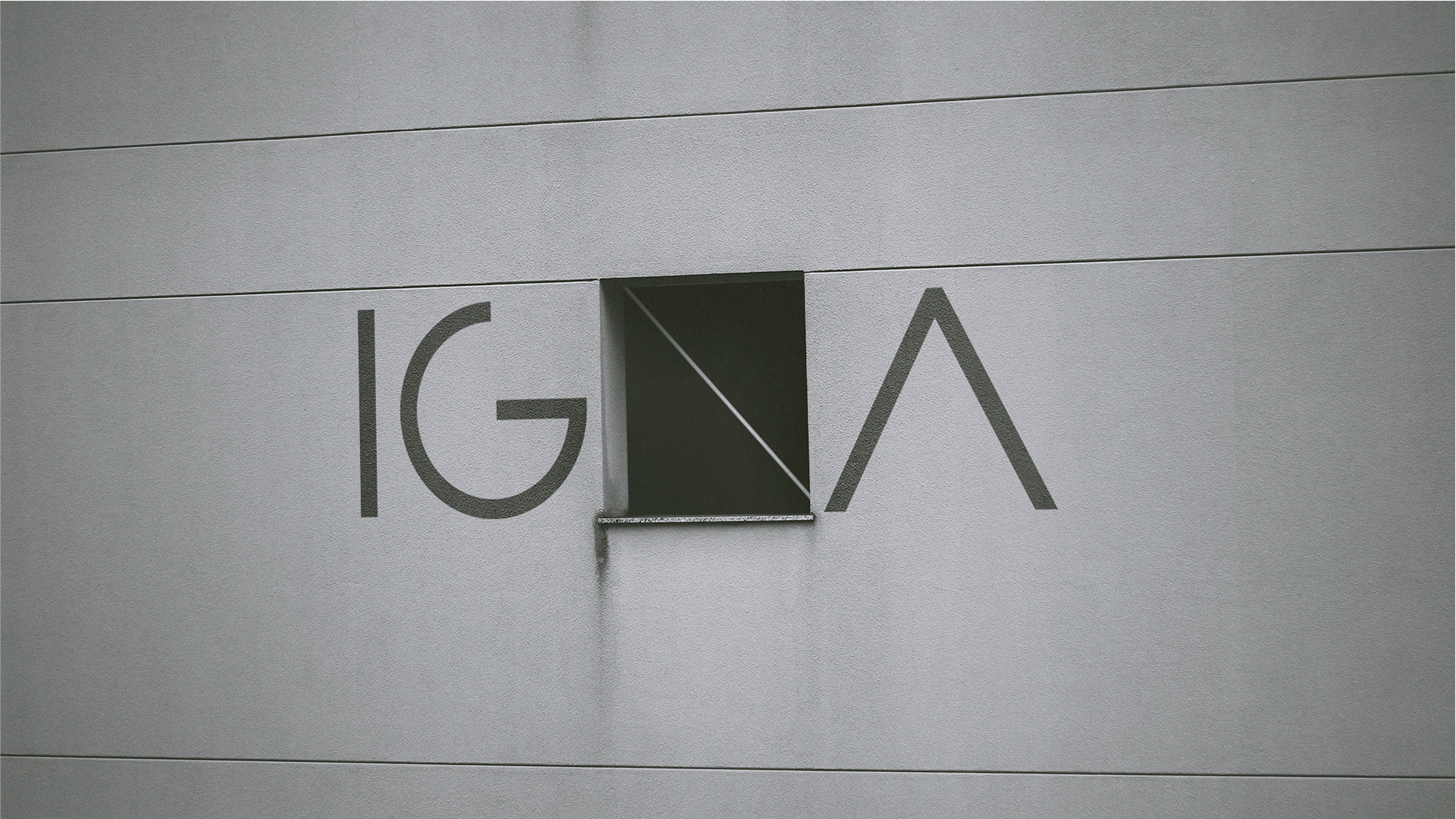
The name IGNA was created from the principle that an architectural project has the role of raising structures in their physical state and elevating human beings in their emotional state. The architect's role is to boost people's connection with their spaces. The project is the force - the ignition - for this role to be fulfilled.
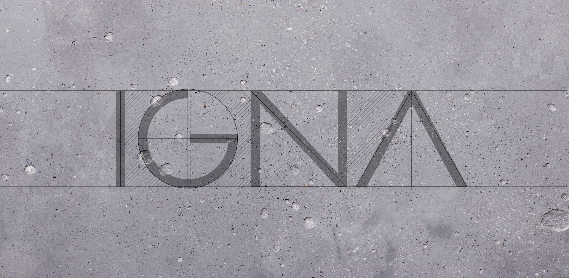
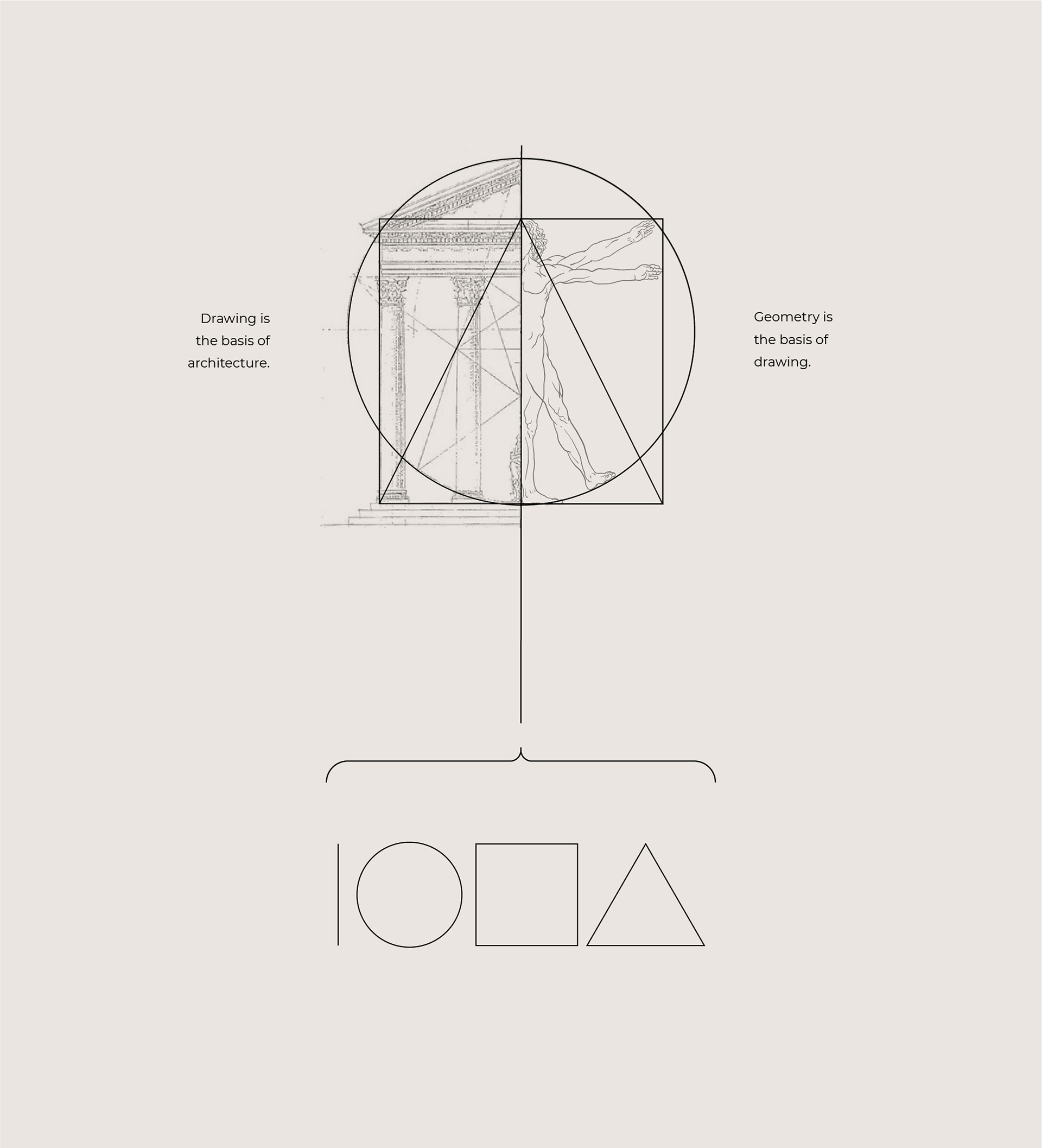
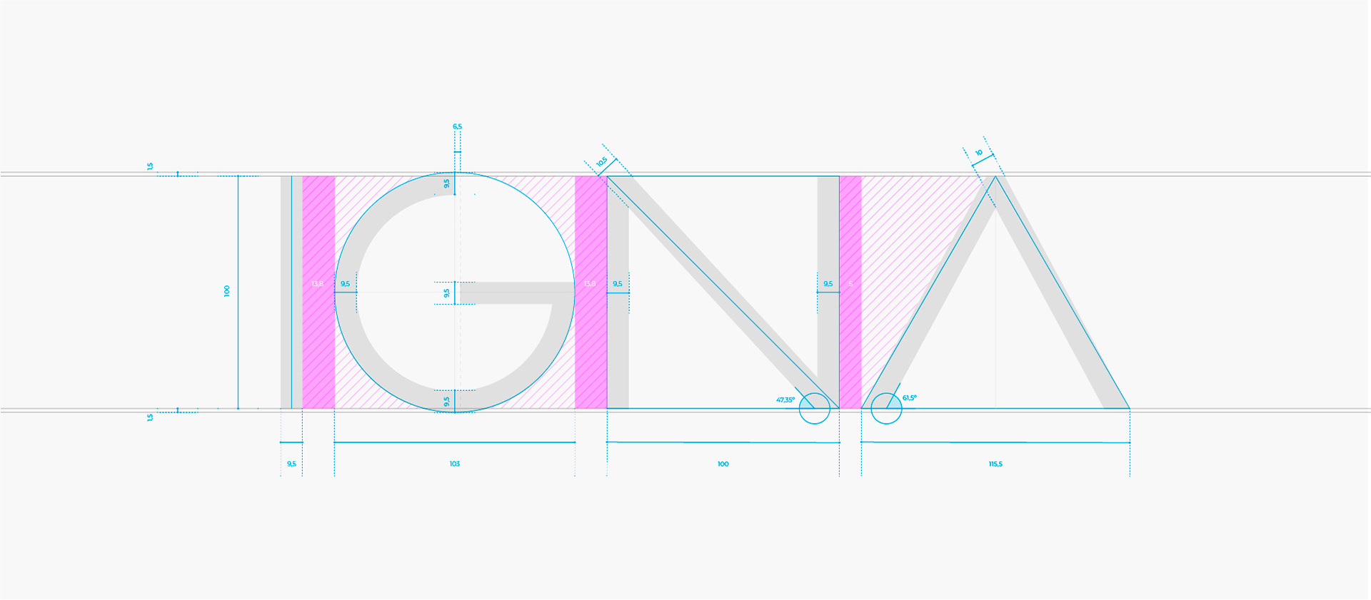
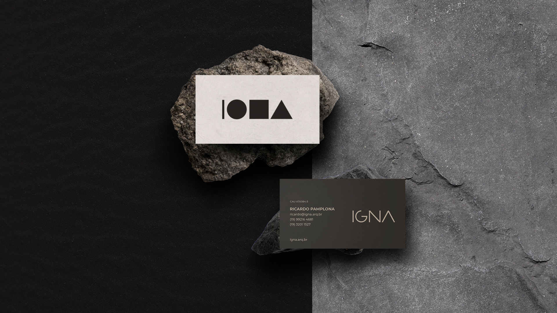
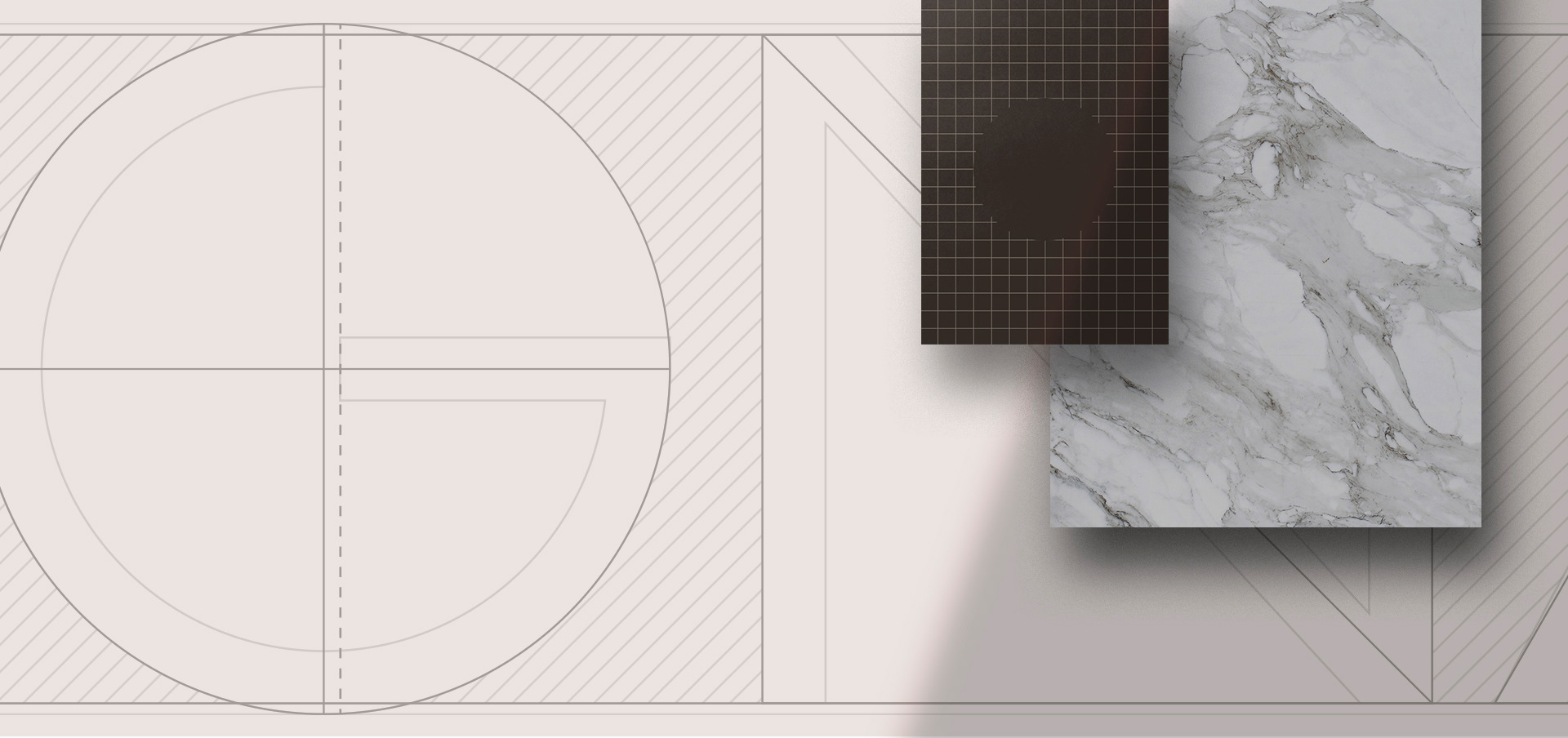
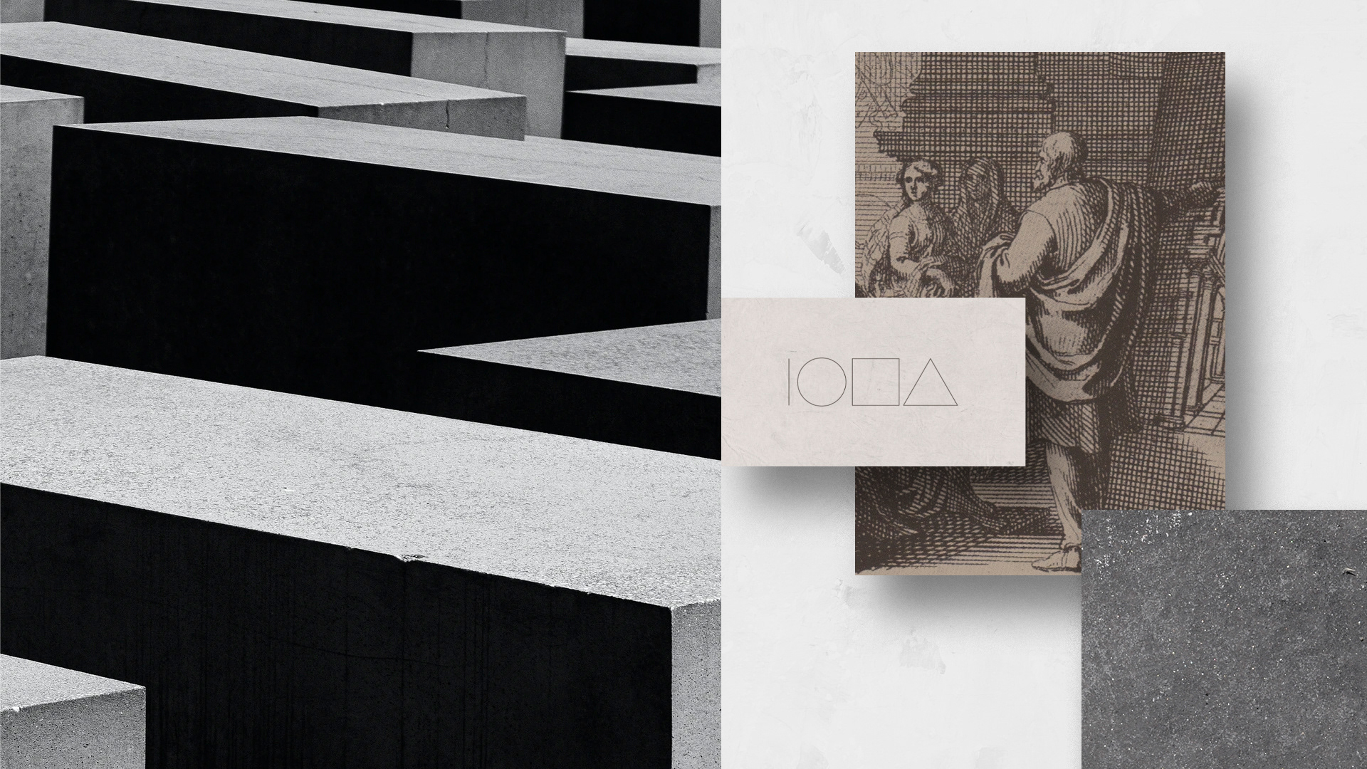
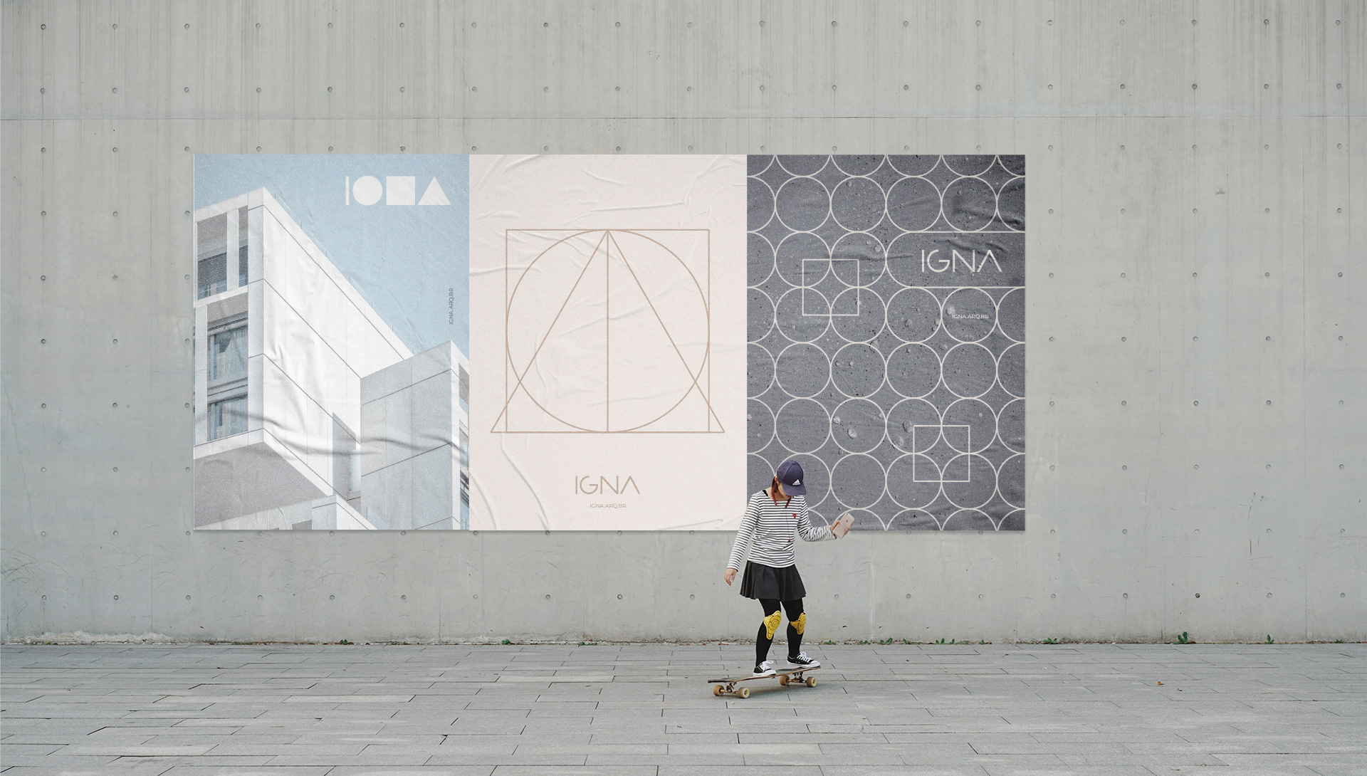
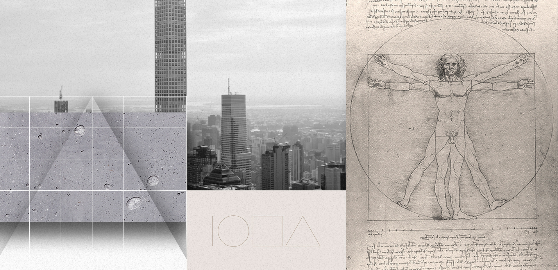
The logotype was created by using basic shapes as guides - the line, the circle, the square and the triangle. These forms synthesize basic principles of building a visual representation, just as it does in an architectural project. In this case, the structure is the strength, the ignition of the logo.
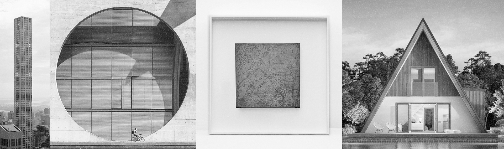
The brand manages to move between different projections of perceptions among its touch points: from institutional and abstinente to artistic and elegant - without loss of unity and connection between those attributes. And so, as the name suggests, the IGNA identity raises the visual mark in its physical and emotional states.


Design Direction
Walter Mattos
Walter Mattos
Design Development
Walter Mattos, Iure Figueira
Walter Mattos, Iure Figueira
Year
2018-2019
2018-2019